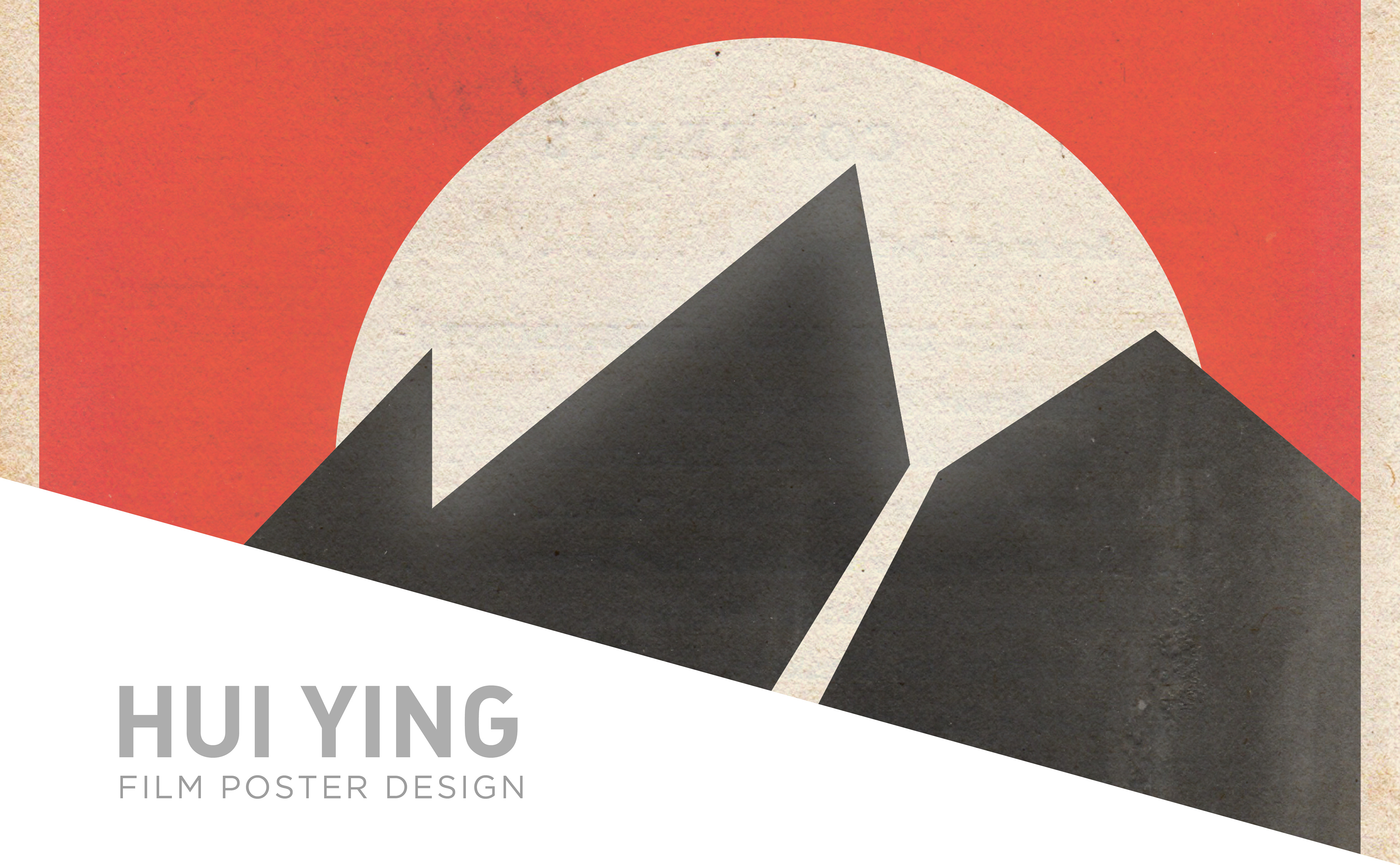
WHO IS HUI YING?
Hui Ying, is a film by SFSU graduate student Hannah Anderson. The film is about a chinese immigrant who loses her family prior to coming to San Francisco during the Gold Rush. She must use her wits to avoid the evils that lie ahead.
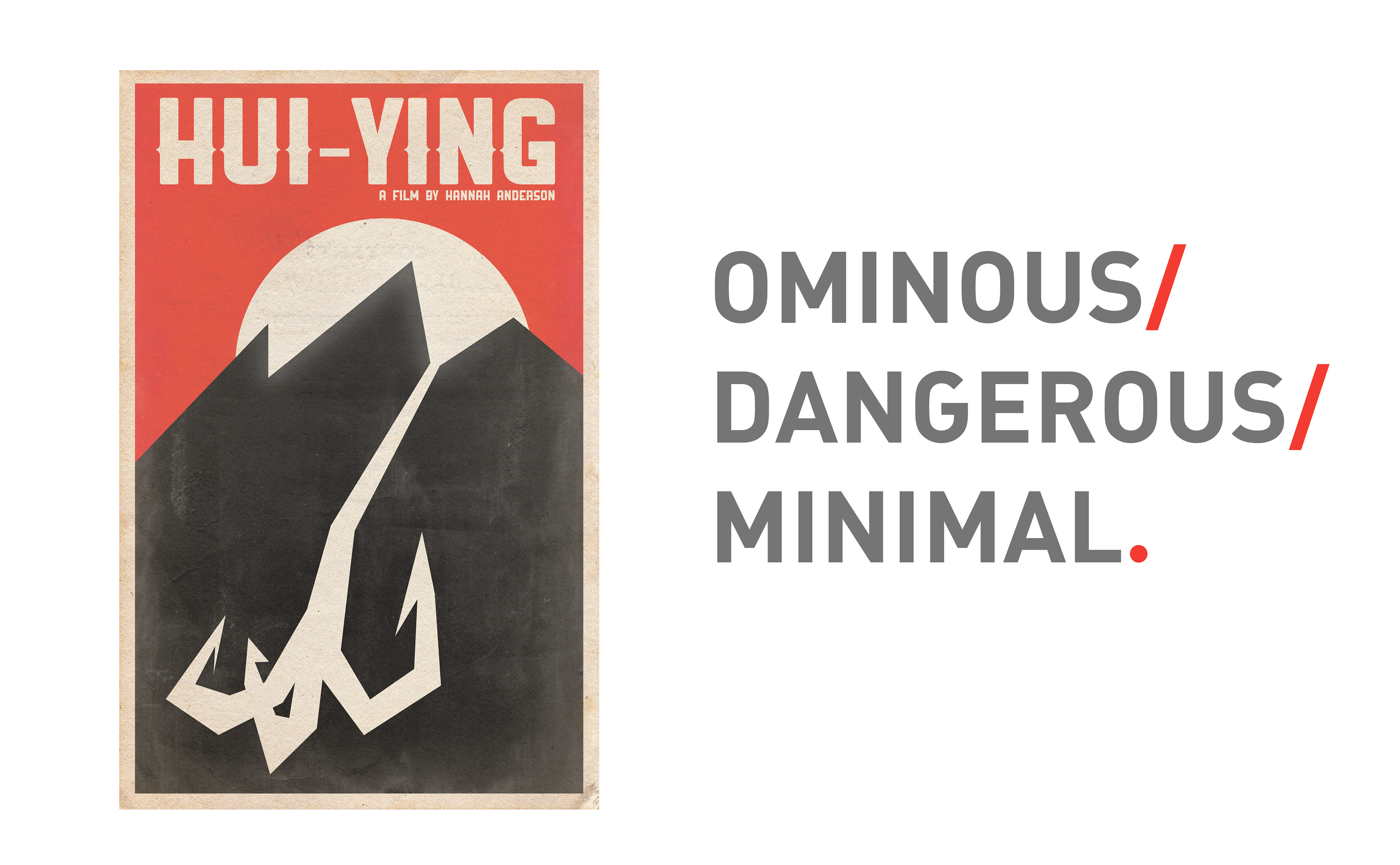
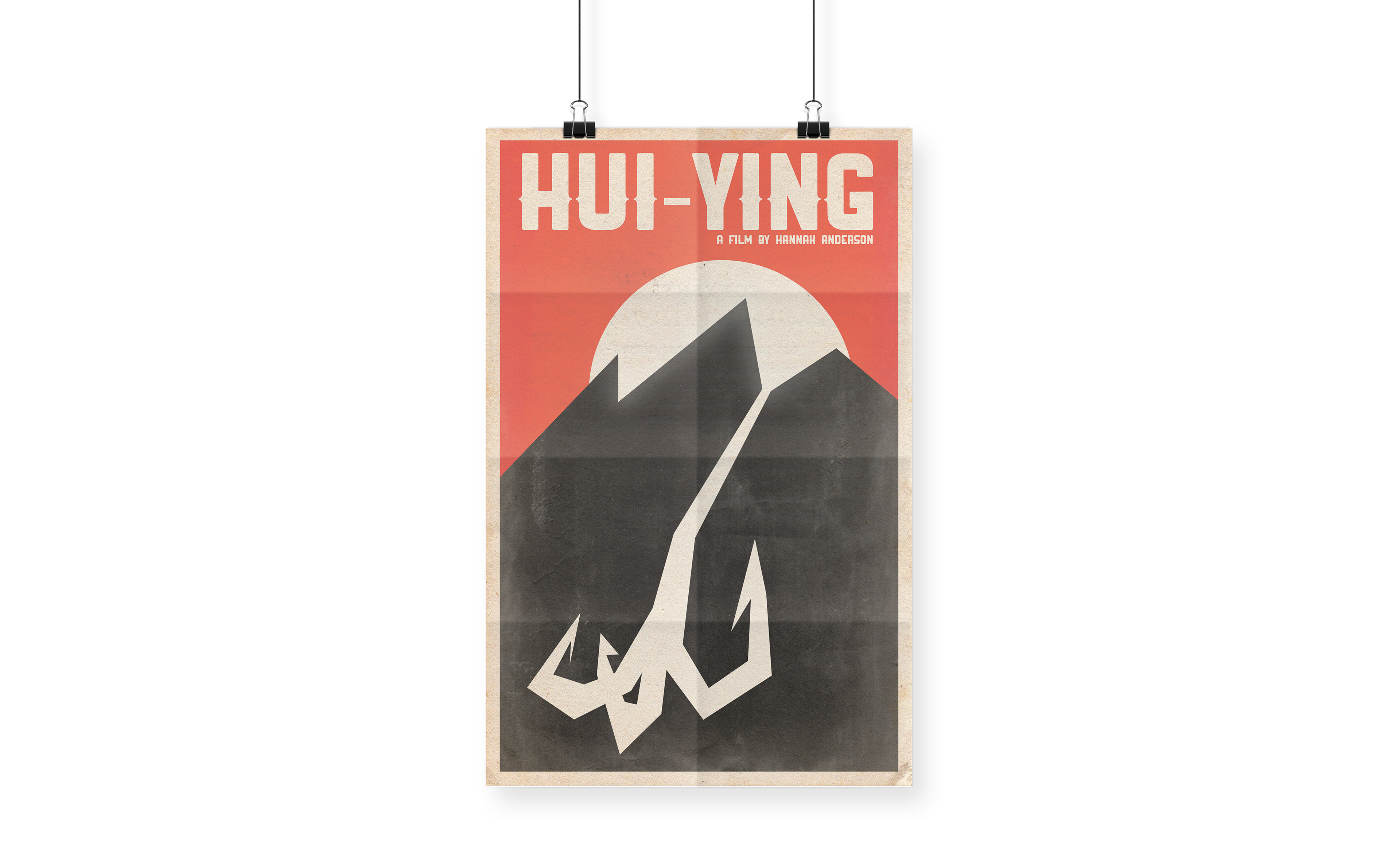
The design for the film poster reflects the danger she must overcome in order to reach the “Golden Mountain” a symbol for prosperity. This section covers the poster design process, followed by the opening sequence animation.
INSPIRATION
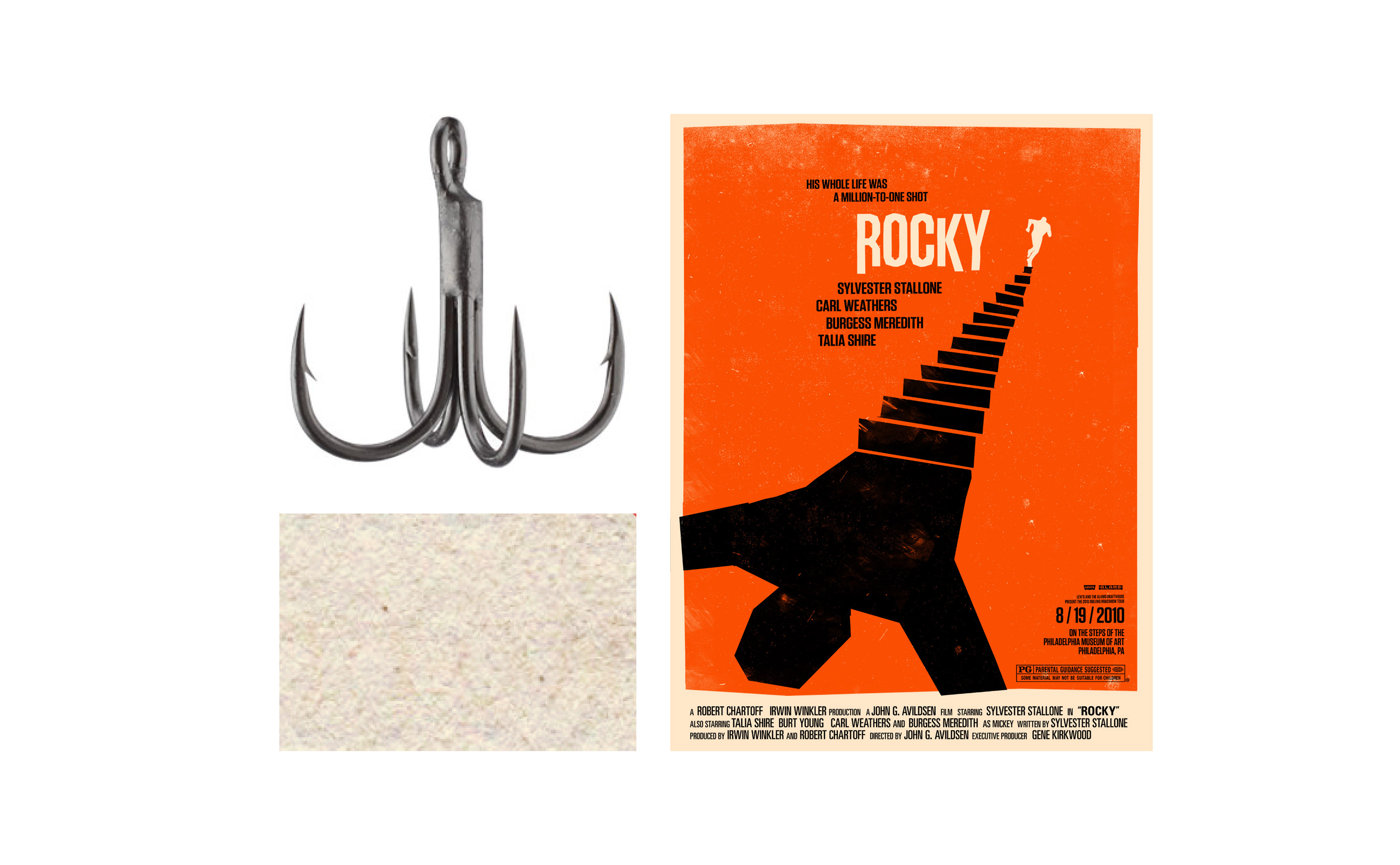
The main inspiration came from the work of Saul Bass. Theres a sense of mystery with his use of bold colors and jagged silhouettes. The film also has a similar tone and adventure that many of Hitchcocks films have, so I felt it would be fitting to go with a similar style.
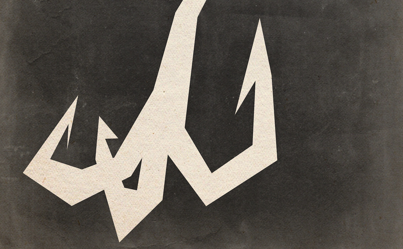
In the film, the protagonist uses a device that allows her to shoot a hook from her wrist. It symbolizes survival and wit, so I felt it should be highlighted int he poster.
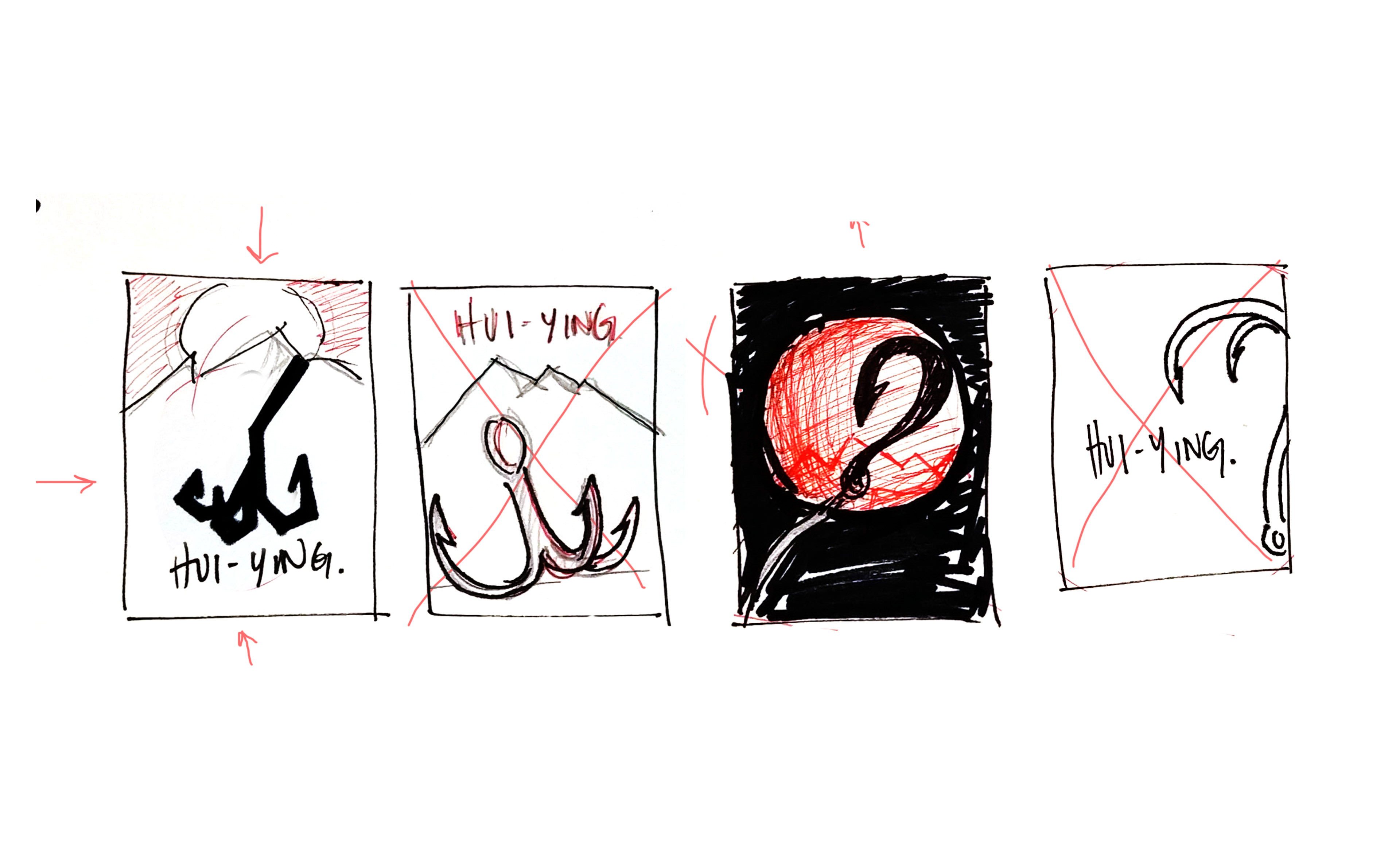
SKETCHES
The hook was one of the most prominent symbols in the film as it is the protagonist’s form of defense. She put together a device which shoots the hook from her wrist. She uses the hook to swing away from danger and to attack her opponents. It is a symbol for her wit, strength, and craft. It had to be featured as the focal point for the poster.
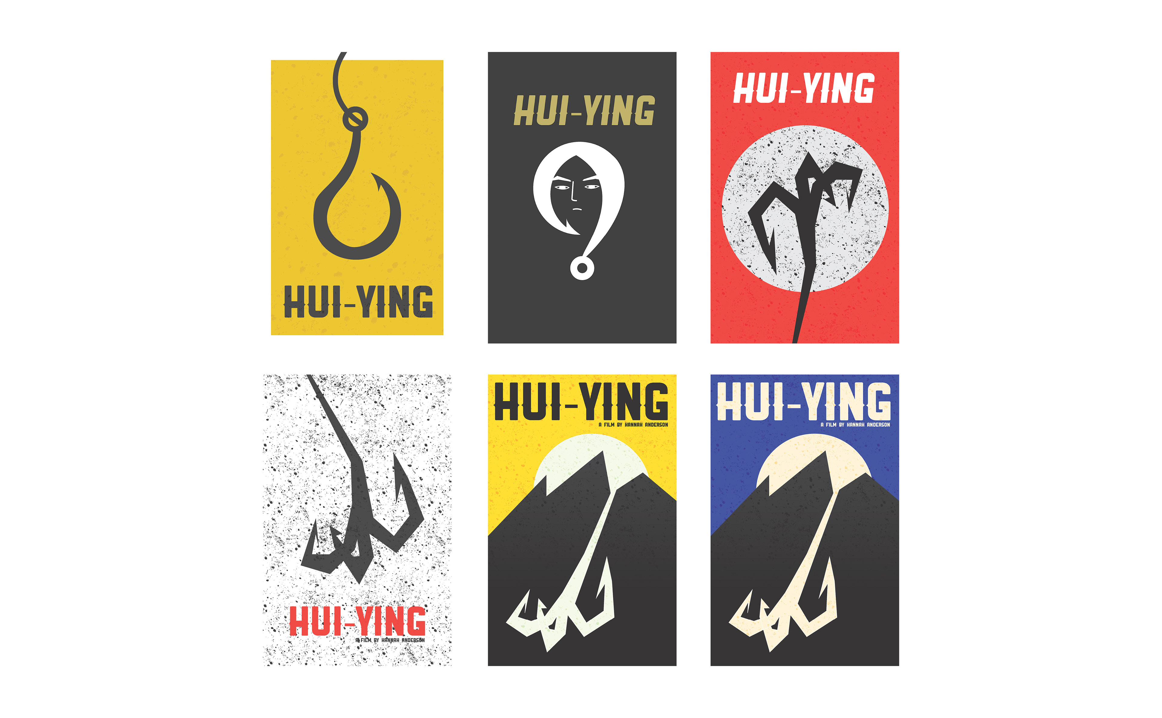
COMPS
Going through multiple variations of the poster, i found that the hook could be used in many ways; on its own, as Hui Ying’s hair, and even a path that leads to the mountain. Keeping the colors to a limit allowd me to emphasize the hook and the moutain by framing the graphics with primary colors.
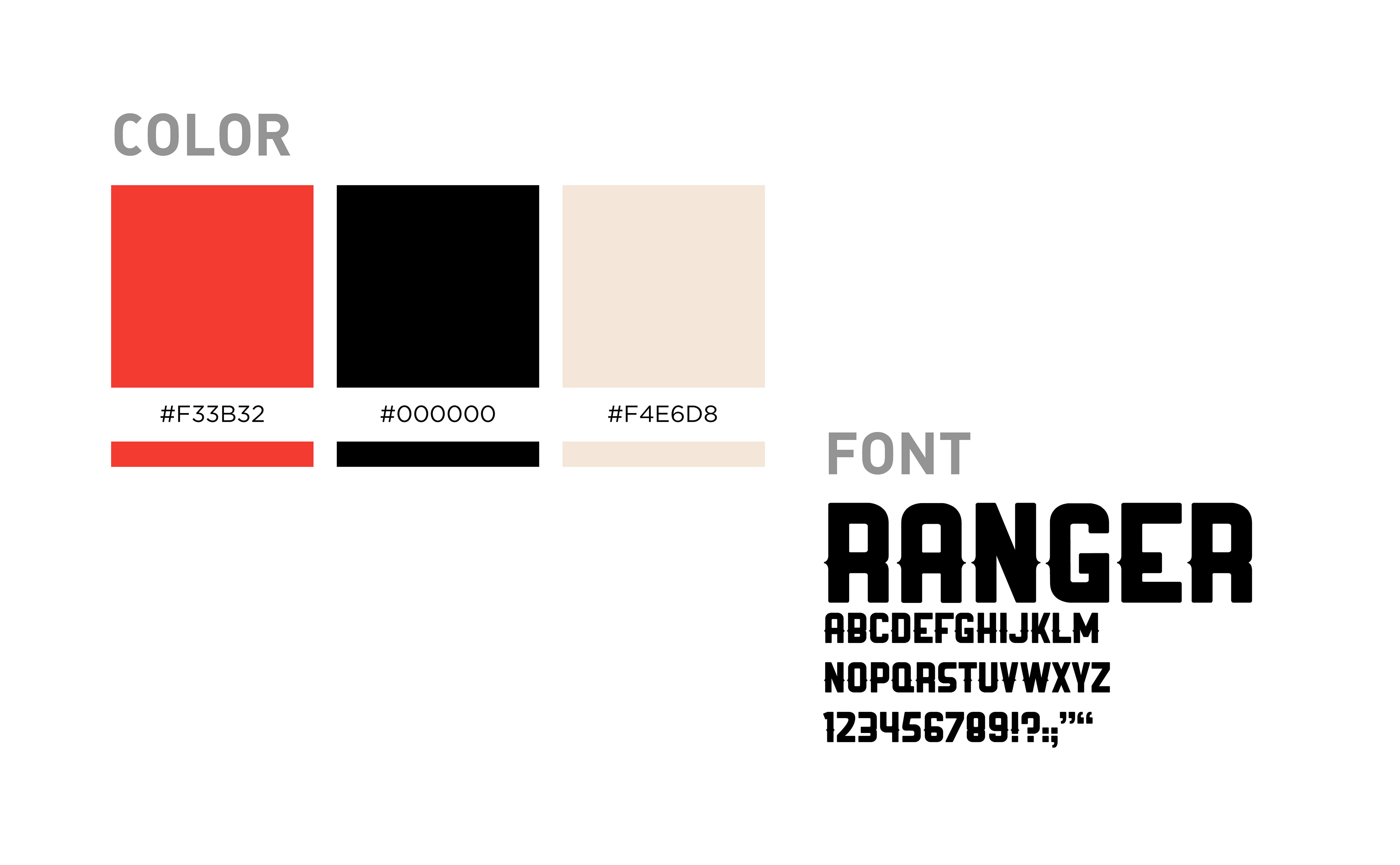
COLOR
This color scheme best created a sense of danger that the protagonist was going to face. The red was lightened with a cream undertone in order to make it more vibrant and give it a sense of livelihood. The cream color serves to create a balance between the black and the red.
FONT
Ranger is a bold and rugged font. Its form matches the graphic elements of the poster.
The font was also originally used in the motion graphic component for the film’s introduction
but was later switched to a different font.
but was later switched to a different font.
TITLE SEQUENCE
On top of desiging the poster for the film, I also created the title sequence in collaboration with the film's director.