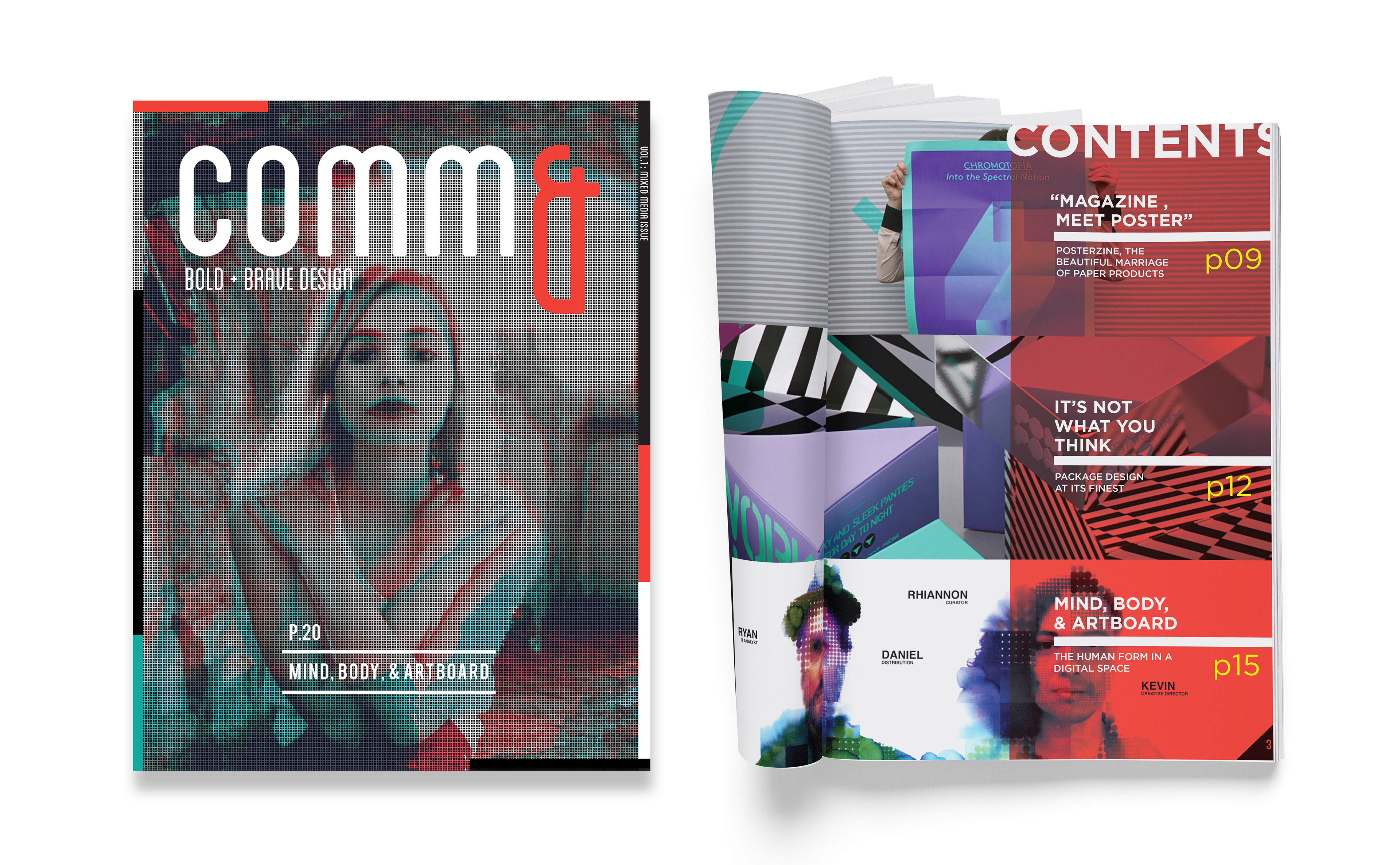
COMM& is a Design Magazine Featuring Unconventional Designs
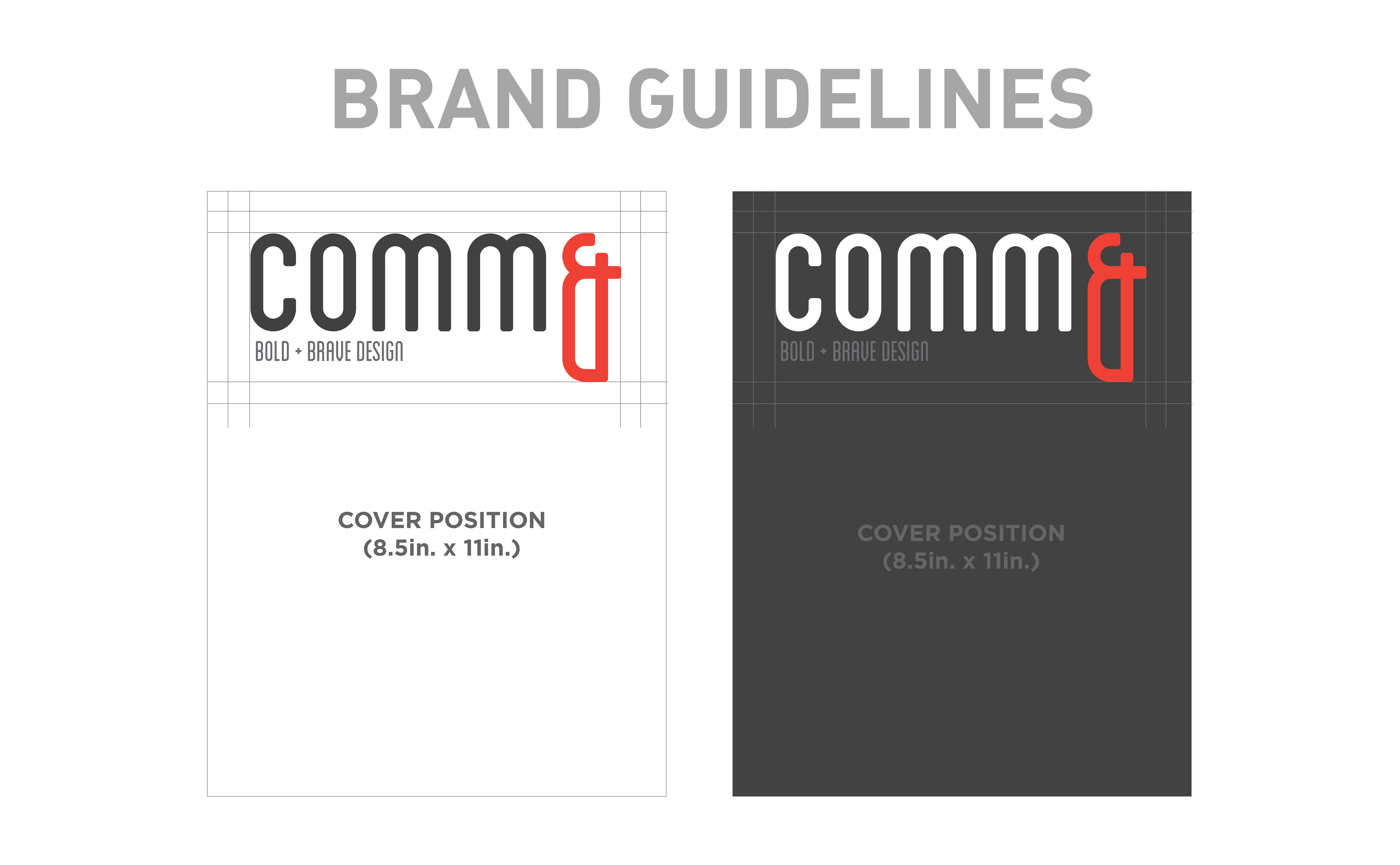
across many mediums including but not limited to print, package, and art. The name of the magazine is an homage to Communication Arts magazine and empasizes the importance of visual communications. The magazine itself breaks some basic layout design principles in order to reflect the "Bold" aesthetic of its content

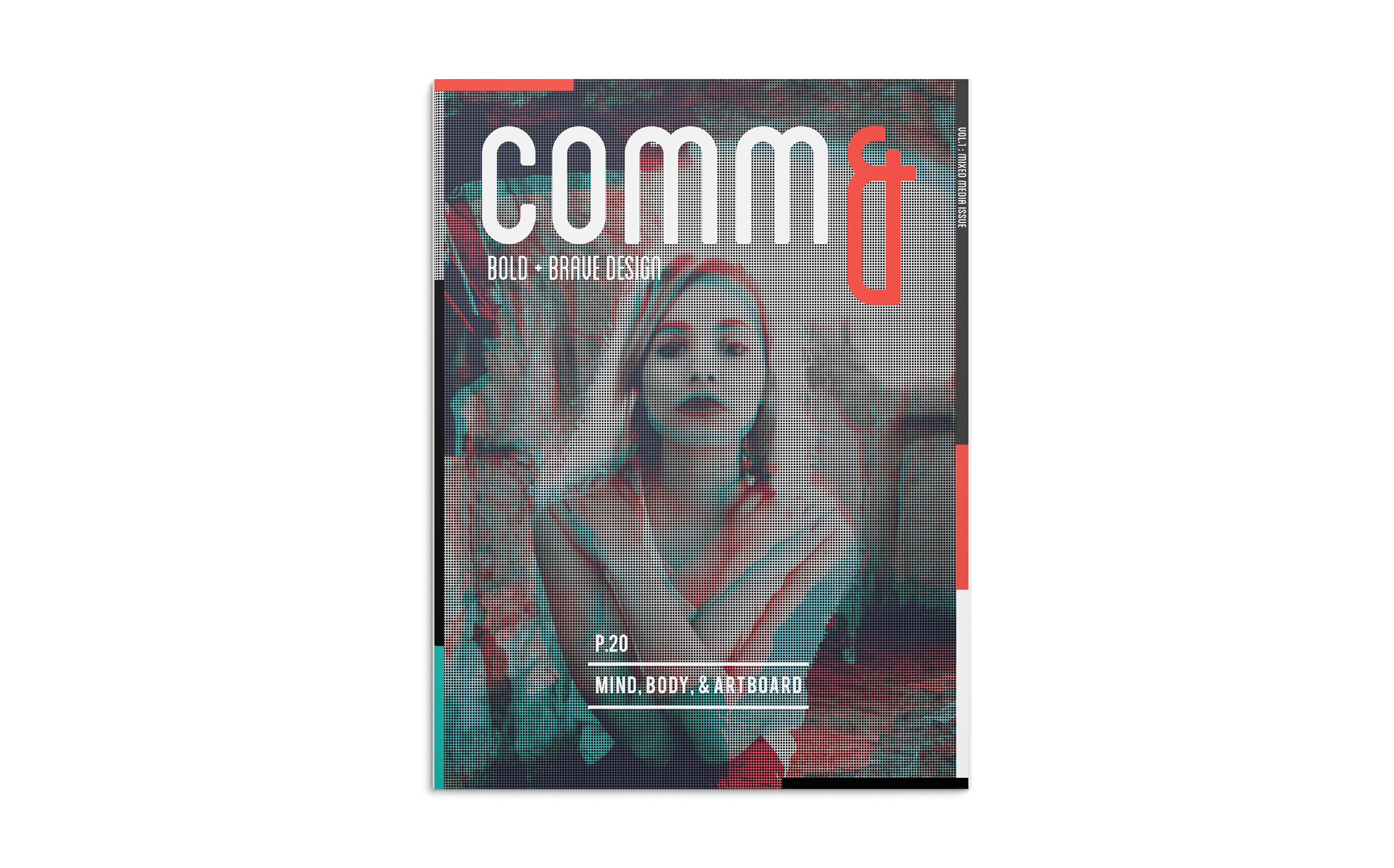
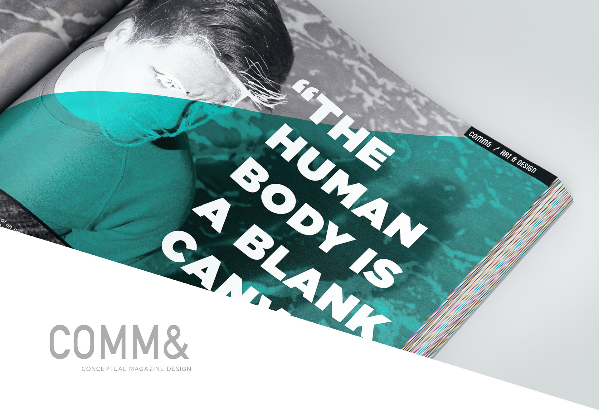
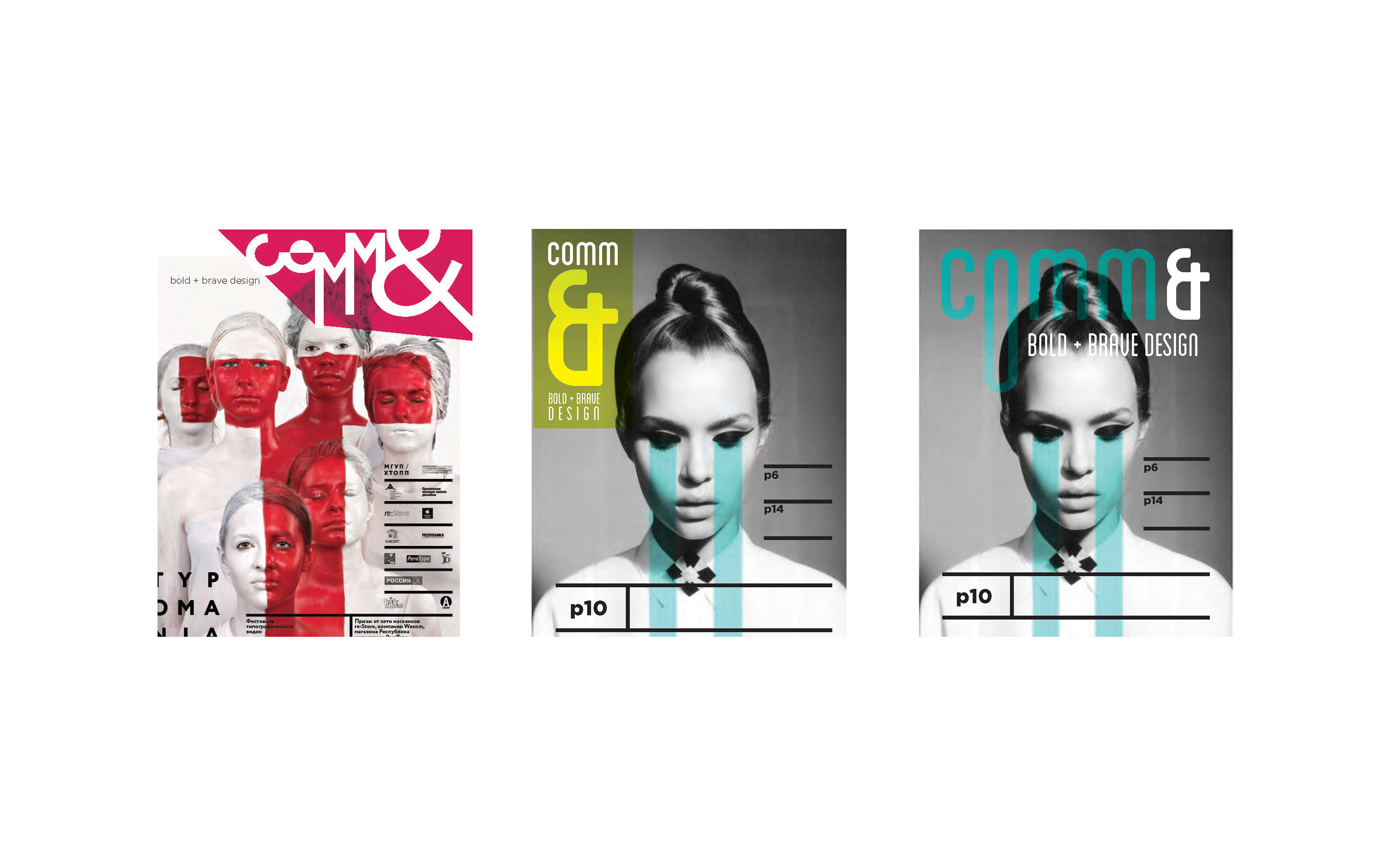
The main feature of this issue focuses on the use of human portraits in design and how the human forms can inspire the designer to create new meanings.
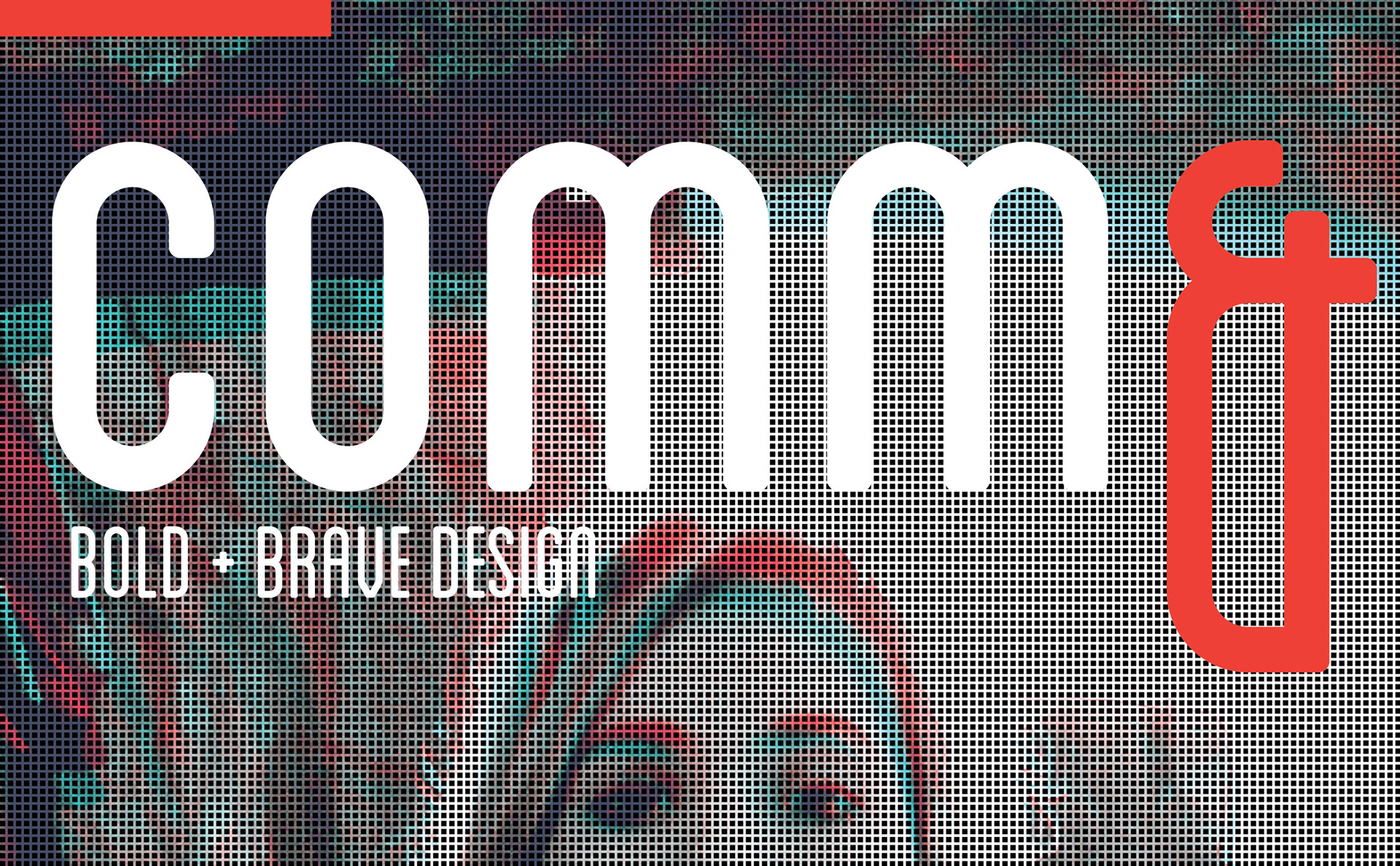
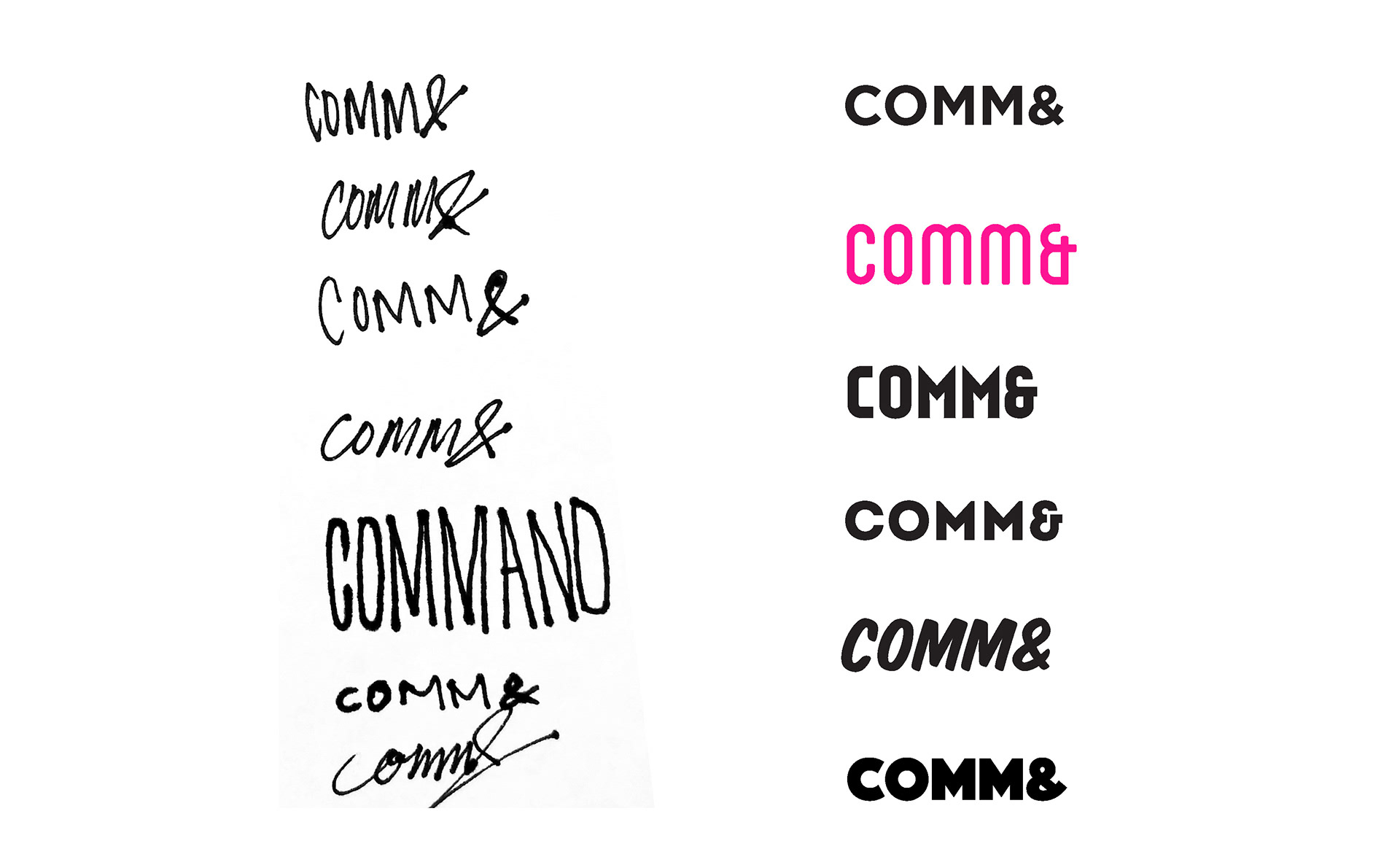
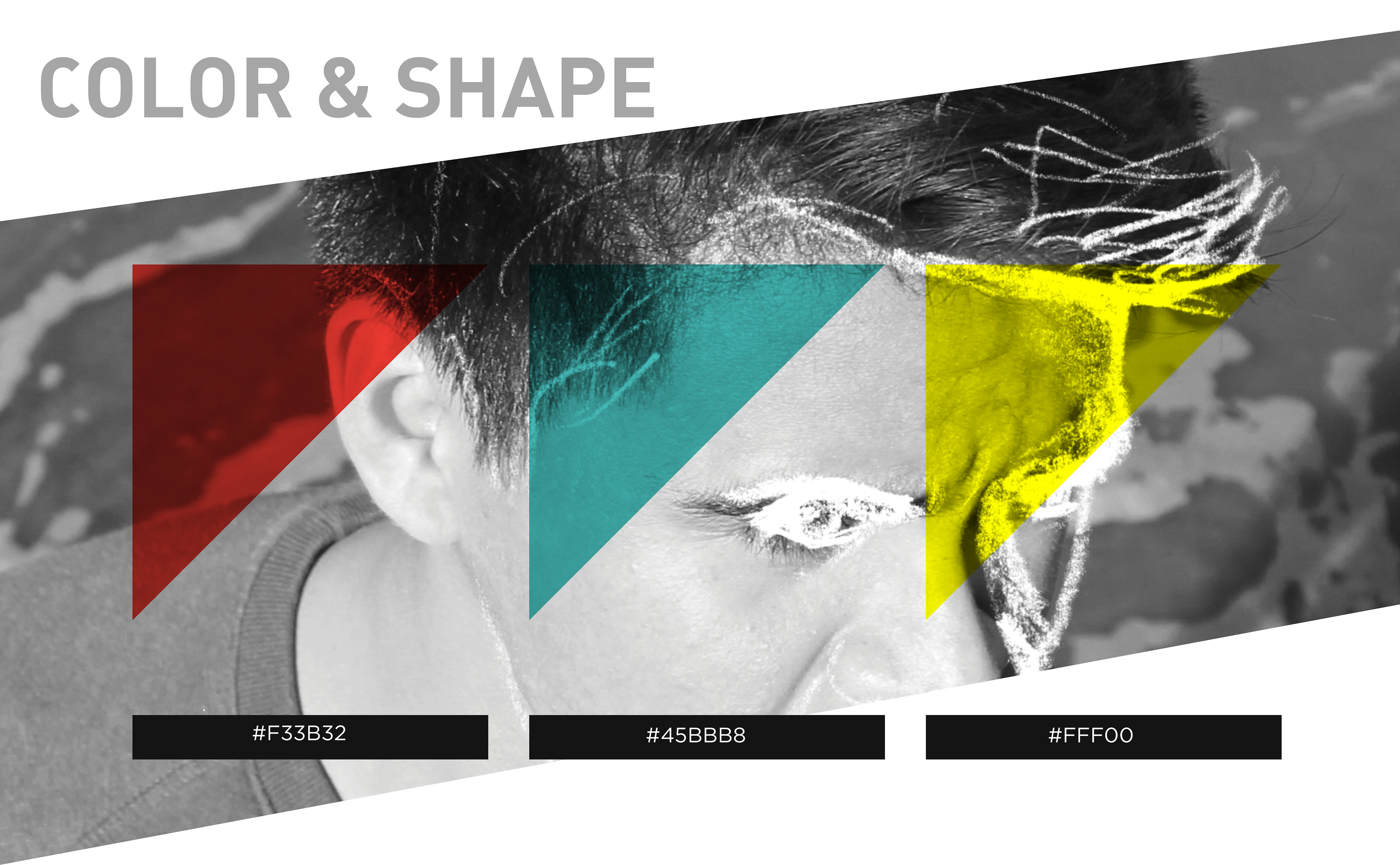
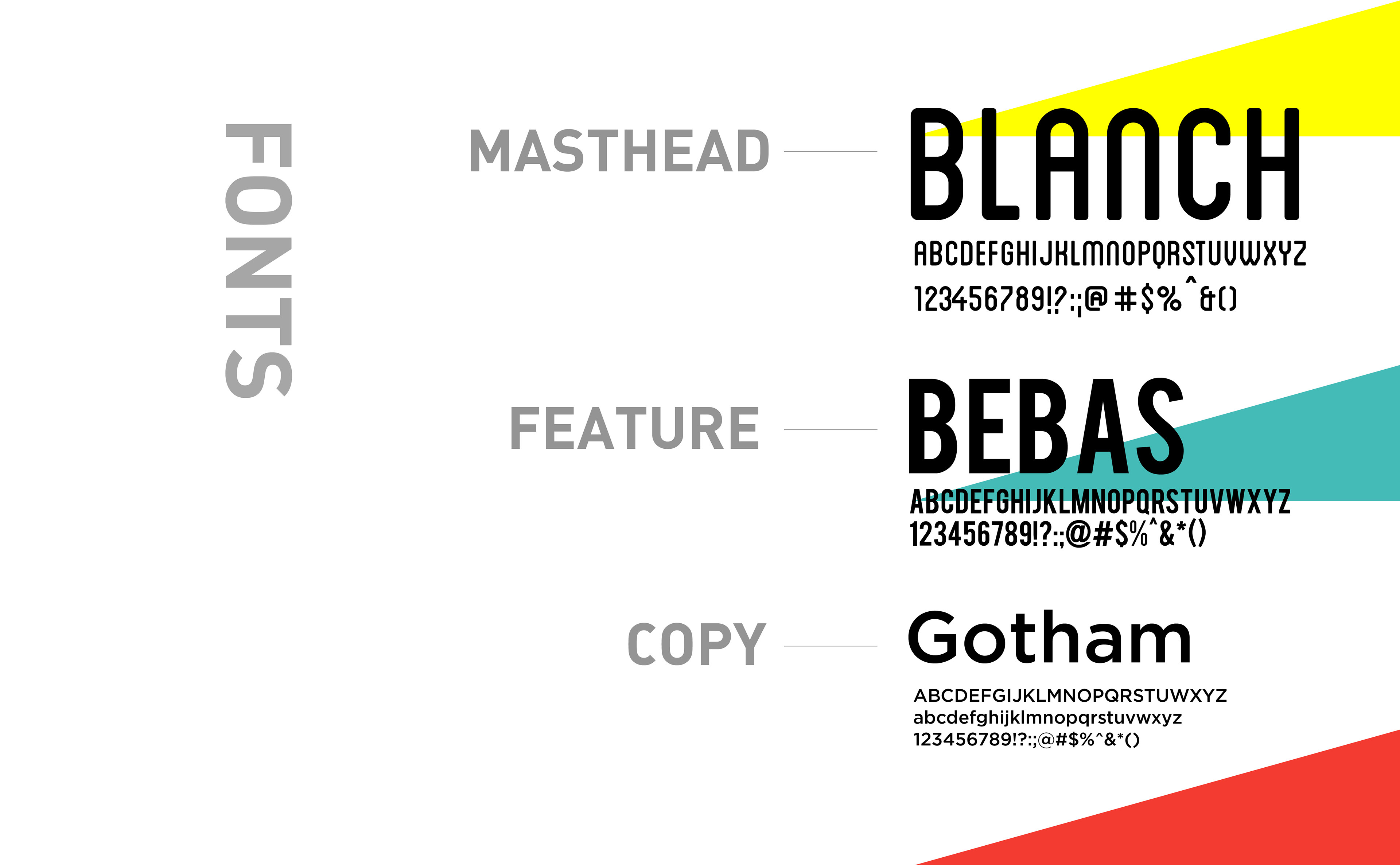
The masthead for COMM& features the font Blanch; a condensed and rounded sans-serif font which creates an organic yet structured form. The elongated and bright red ampersand empasizes the breadth of the content inside the magazine.
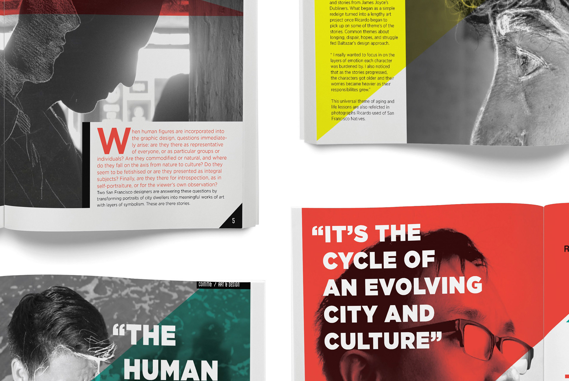
This feature includes the work of Phillip Hua, an SF artist whose work was featured on muni busses in place of ads. The work on the image above belongs to him.