WELCOMING PEOPLE THROUGH TYPE
Every neighborhood in San Francisco is unique and carries a distinct visual language. This font design pulls from the characteristics of the Outer Sunset, and embodies the multilayered and transparent nature of the small businesses that line Taraval St.
Every neighborhood in San Francisco is unique and carries a distinct visual language. This font design pulls from the characteristics of the Outer Sunset, and embodies the multilayered and transparent nature of the small businesses that line Taraval St.
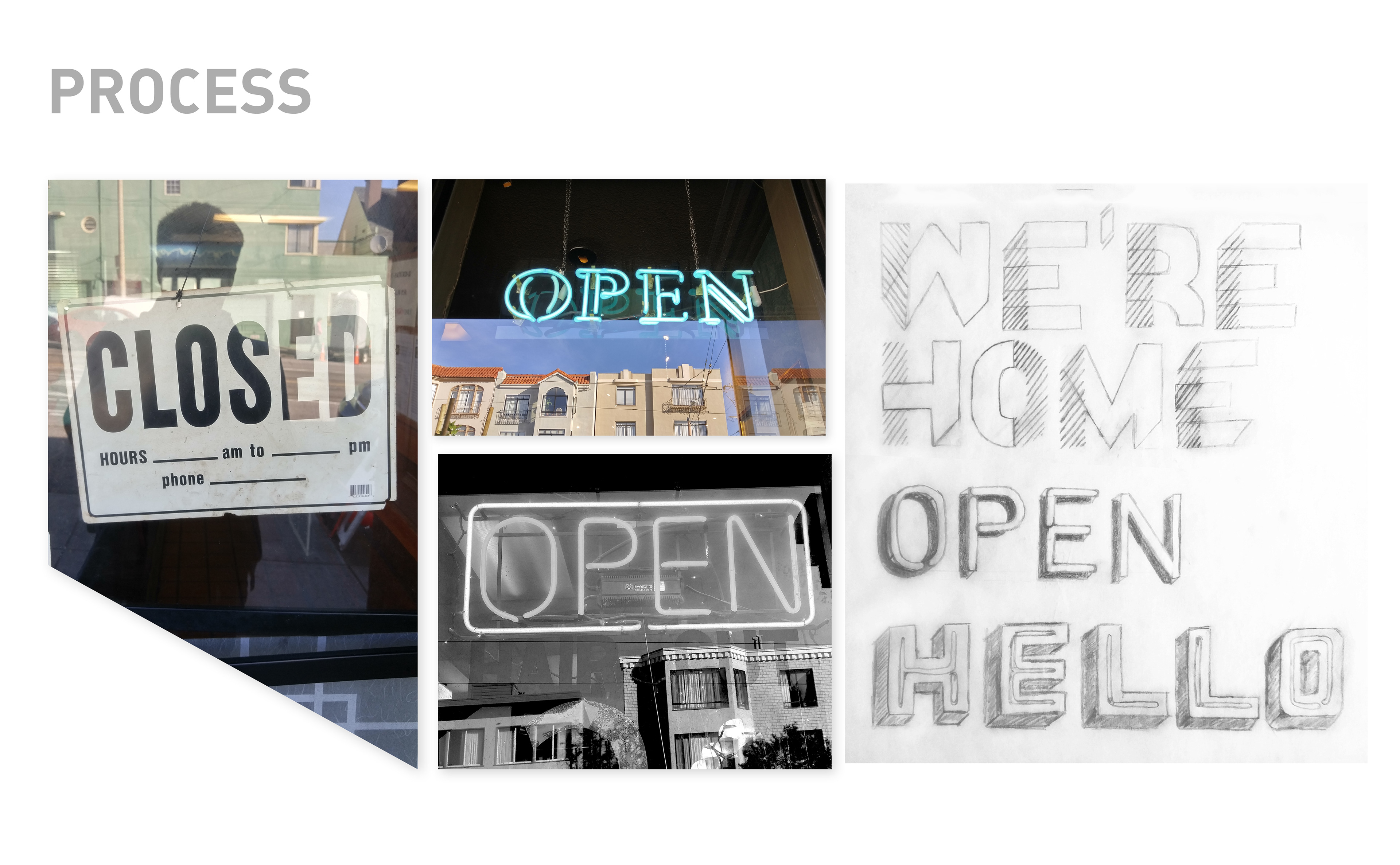
INSPIRATION
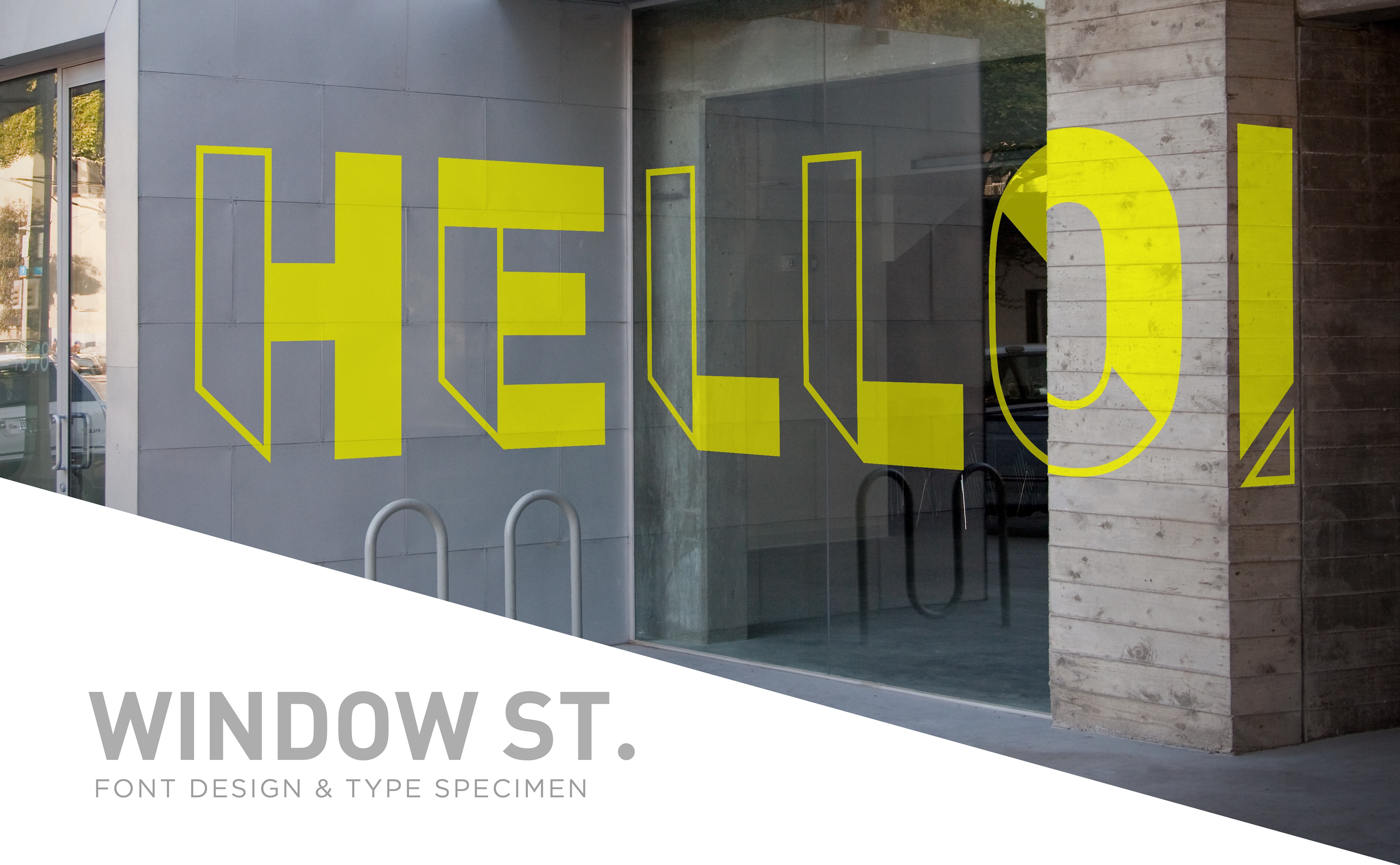
Upon walking up Taraval Street toward 19th Ave., I couldn’t help but notice the housing to business ratio of the neighborhood. Many of the shops and eateries are unique and family owned each catering to the neighborhoods needs, essentially fueling the residents on Taraval Street. As I stopped to photograph the businesses I noticed the unique ‘OPEN’ & ‘CLOSED signage each location displayed. These signs have multiple meanings to the public: an invitation, an apology, or even a promise for return. These signs represent the human aspect of a business.
CONCEPT SKETCHES
Initial pencil sketches experimented with various styles that would convey a sense of layering and depth. Layers were created by breaking down the letterforms into sections, and shadows were created by letters mimicking neon signage. Further, three-dimensional techniques give an illusion of depth.
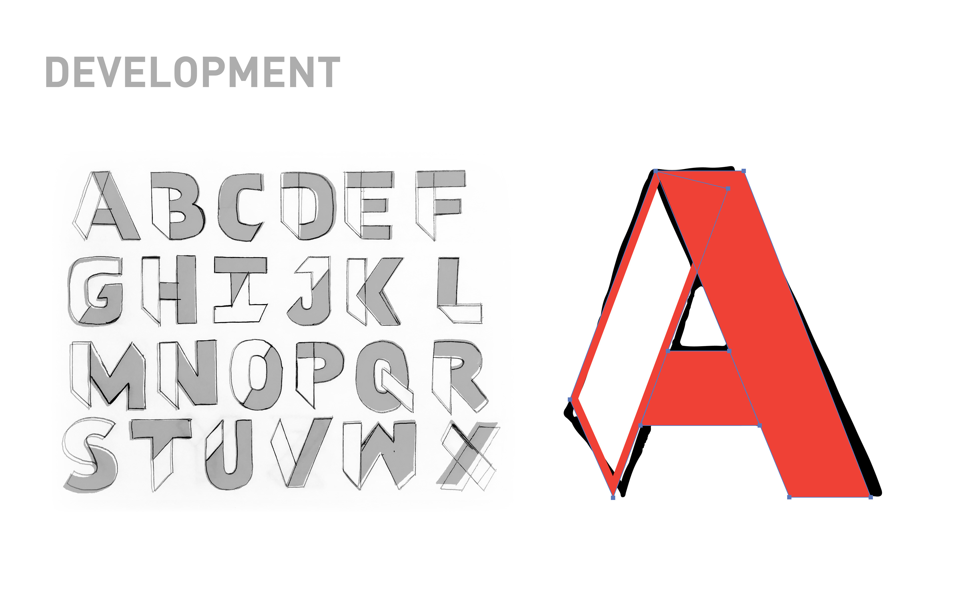
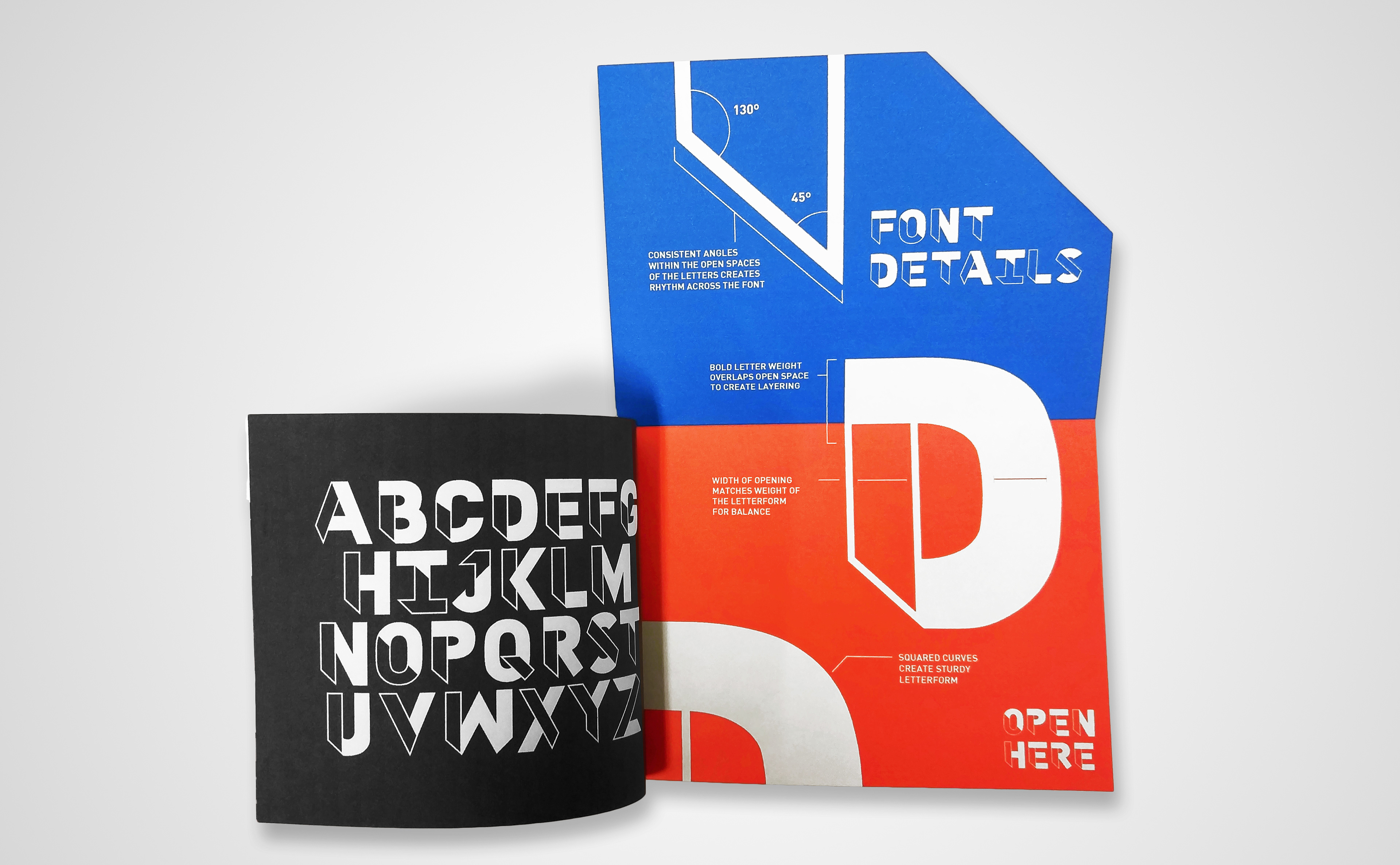
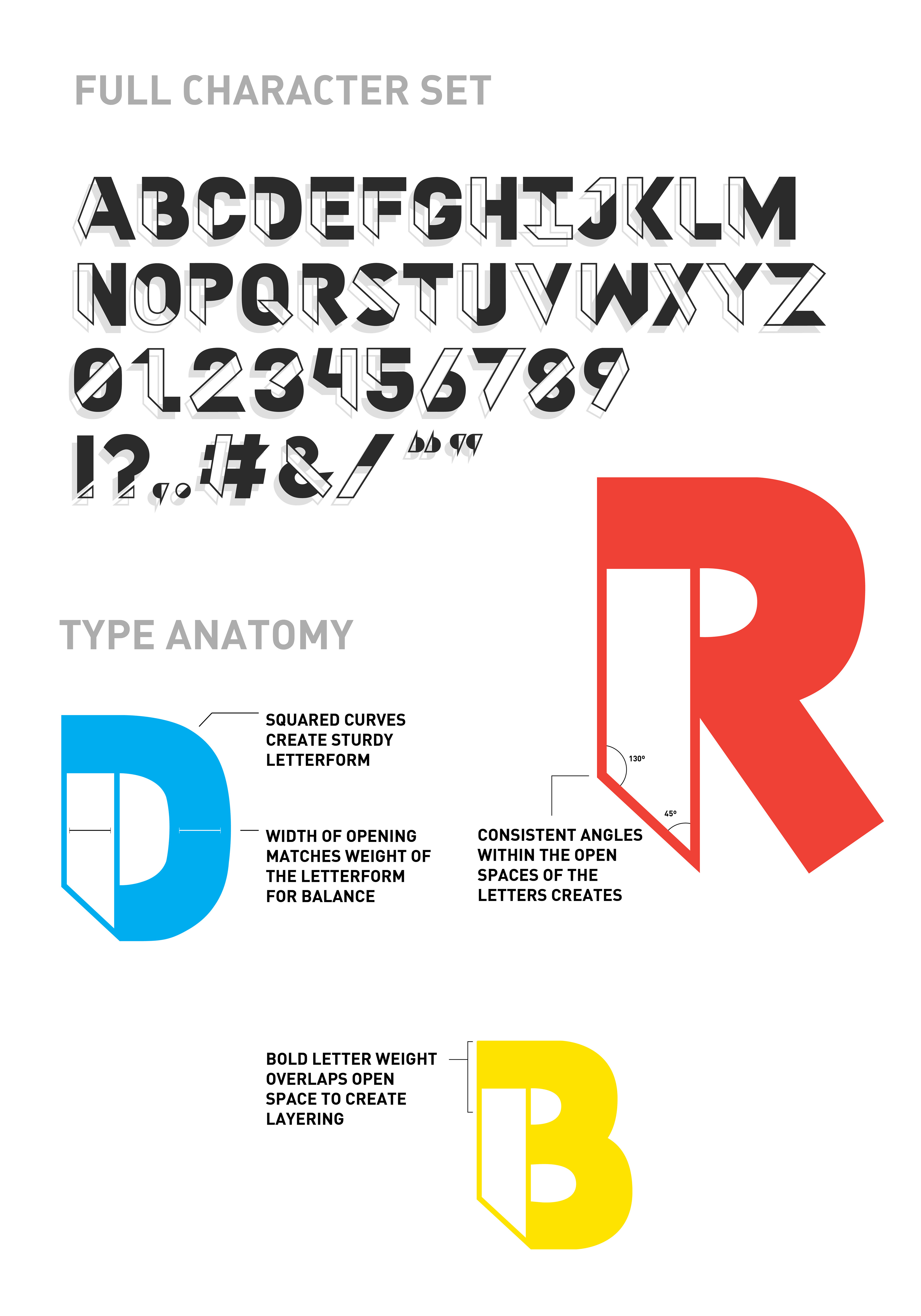
DESIGNING CONSISTENCY
The layering of outlined forms and filled solids to create the letterforms best symbolizes the concept of “OPEN” and “CLOSED” spaces. At this stage, each letter was meticulously sketched out to ensure they portrayed a consistent visual language. First, as outlined structures, then filled in for contrast creating the final letterform.
Next, each letter was traced and recreated in illustrator. This process allowed for the letters to be fine-tuned by copying and pasting the forms repeated through the font.
TYPE SPECIMEN BOOK
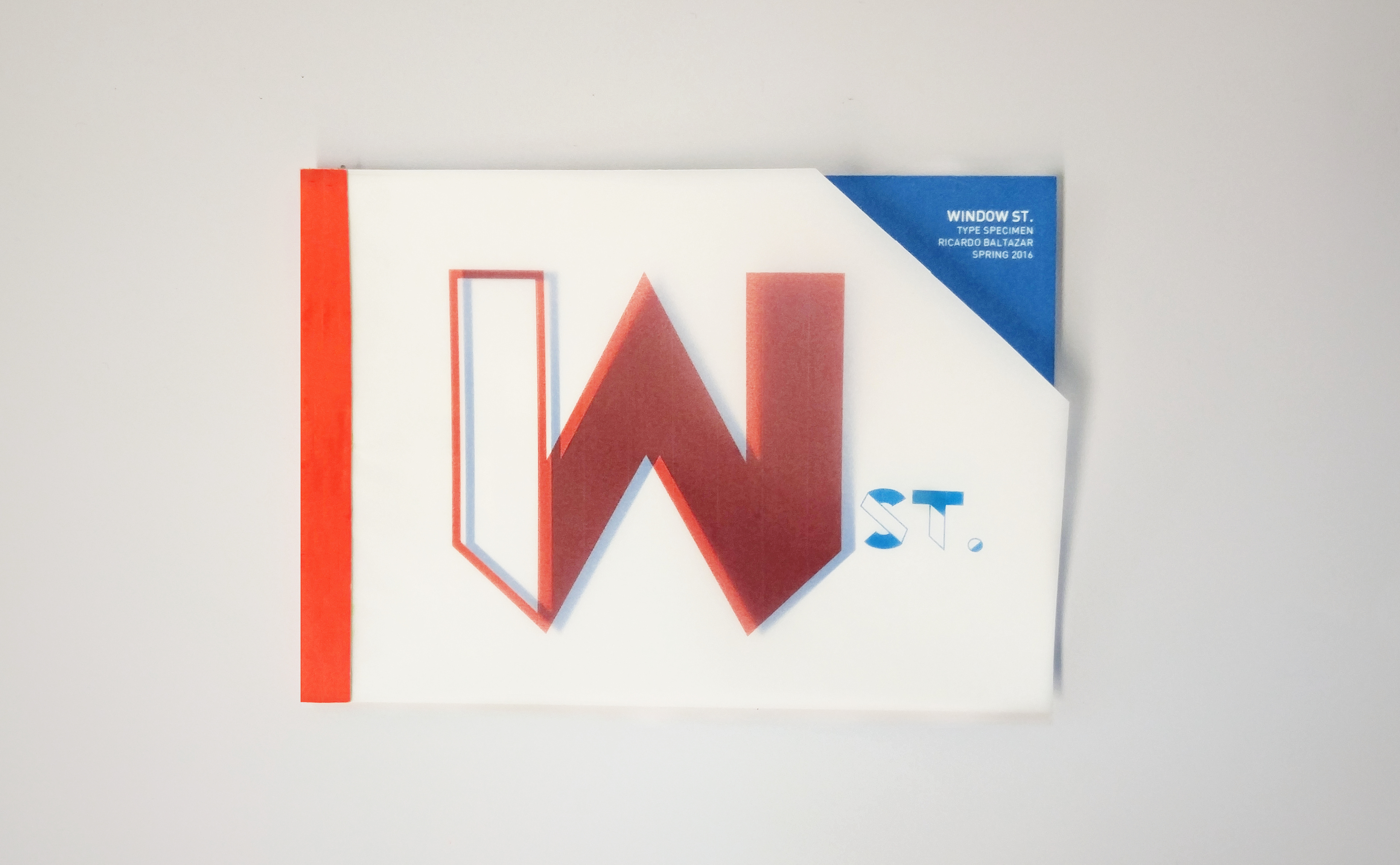
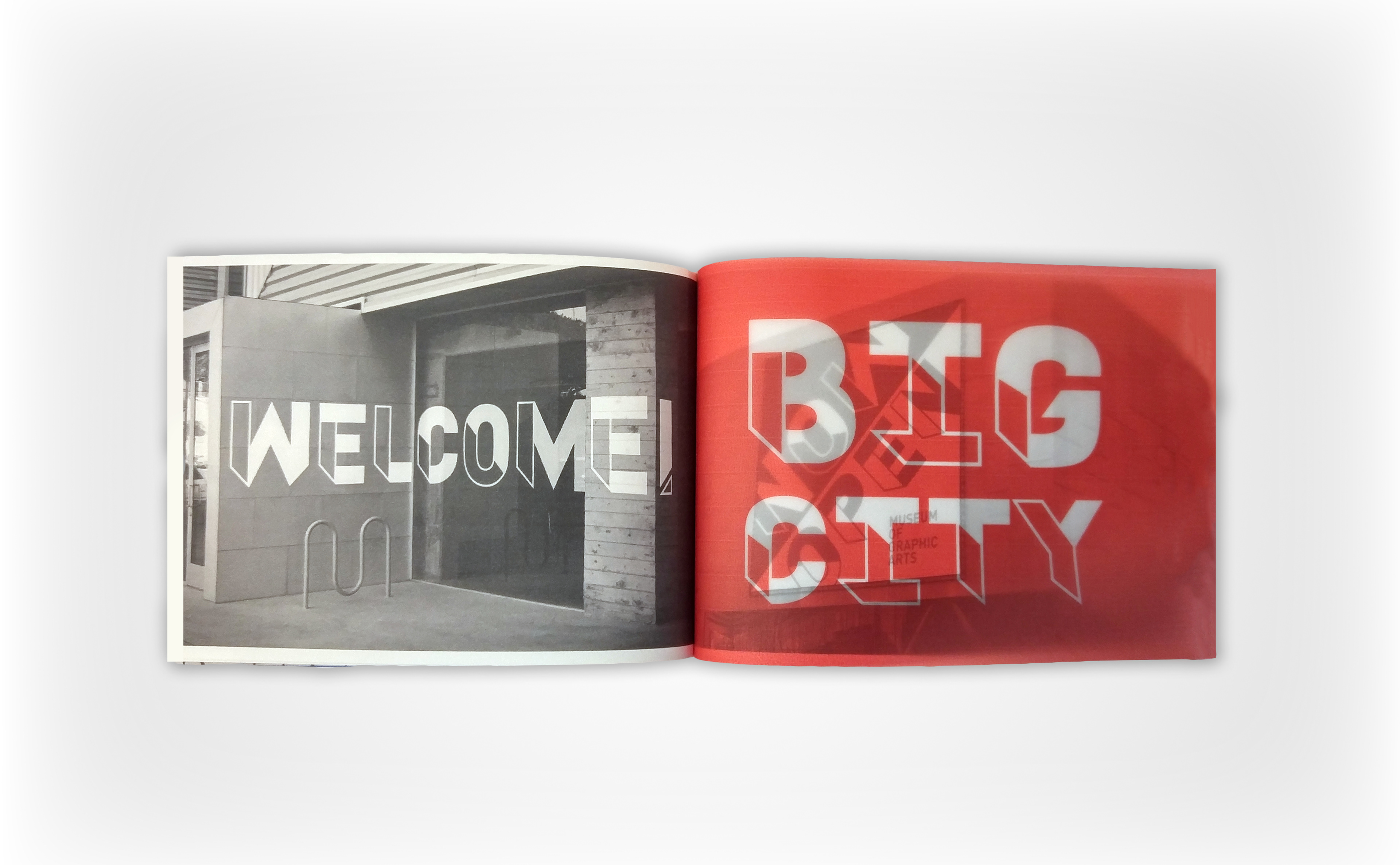
In order to showcase the characteristics of the font, the specimen book features elements that symbolize layers. A multi-layered effect was created through various techniques: From the velum sheets used to create a physical “multiply effect,” to the pull out page revealing the font details.