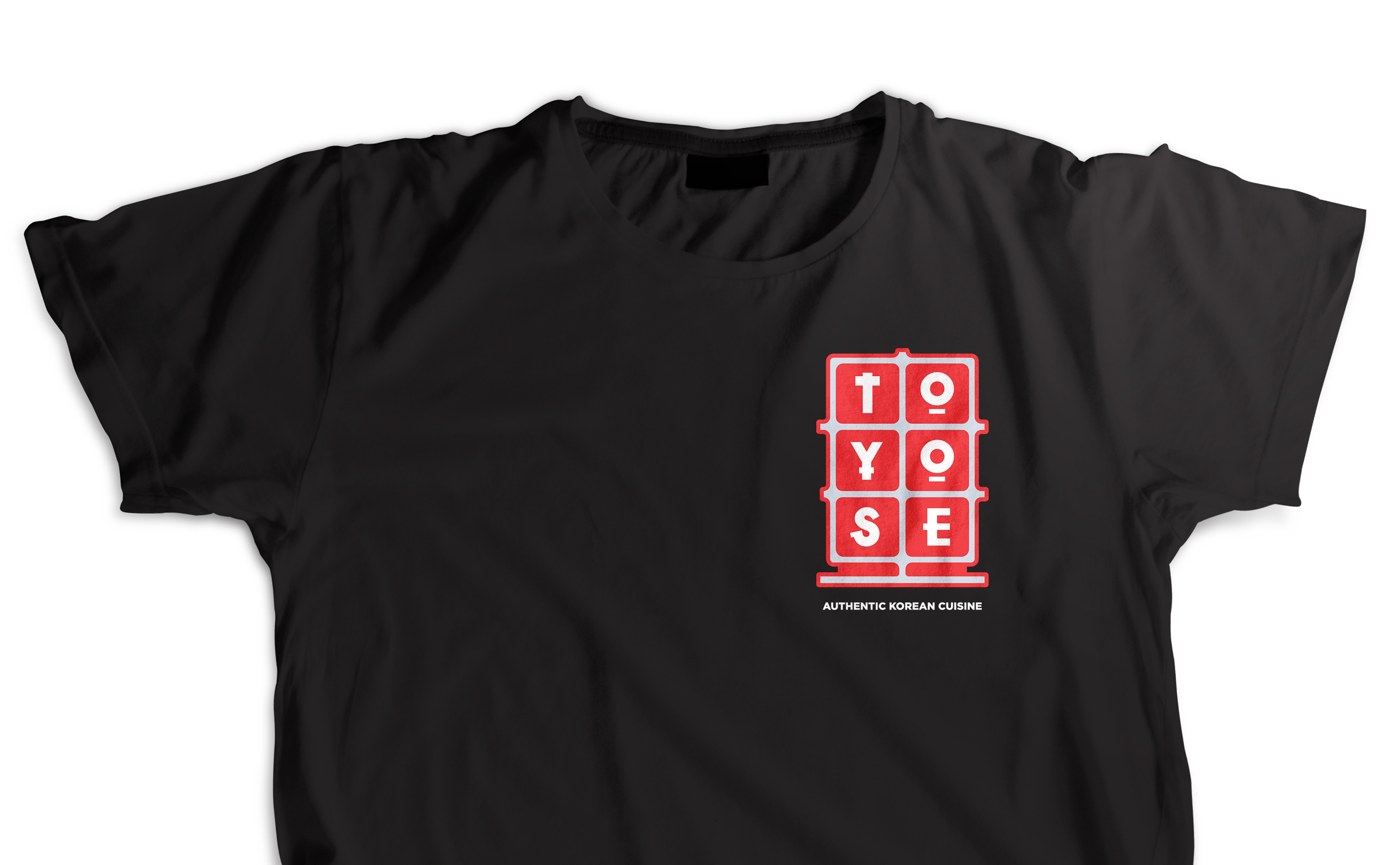
The purpose for this brand redesign is to create an identity for the restauraunt that reflects the bright and happening environment at Toyose in order to attract a new crowd of millenials looking for a fun late night experience. A redesigned logo and collateral will help to achieve this
new identity.
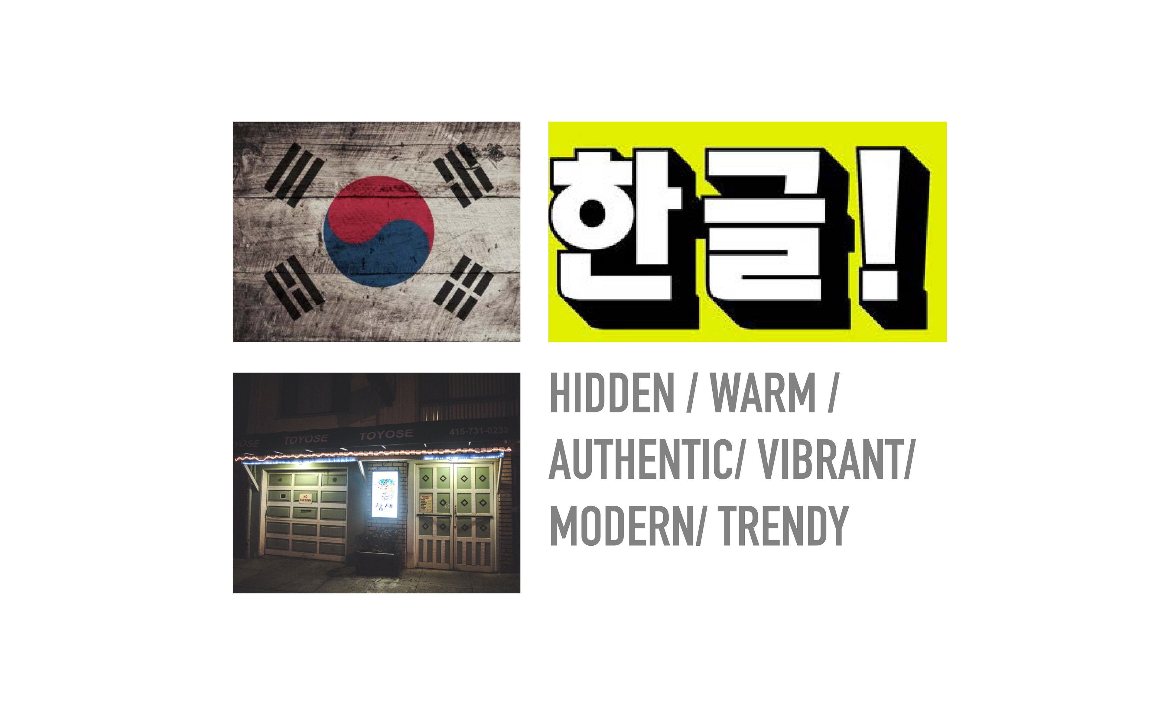
It will feel inclusive and enticing, yet current and approachable. What do we want them to think and feel? They will feel as if they about to escape from their worries and into a unique experience. The design will be Hidden, Warm, Comforting Authentic, Ambiguous, Welcoming, Vibrant, Modern, and Trendy.
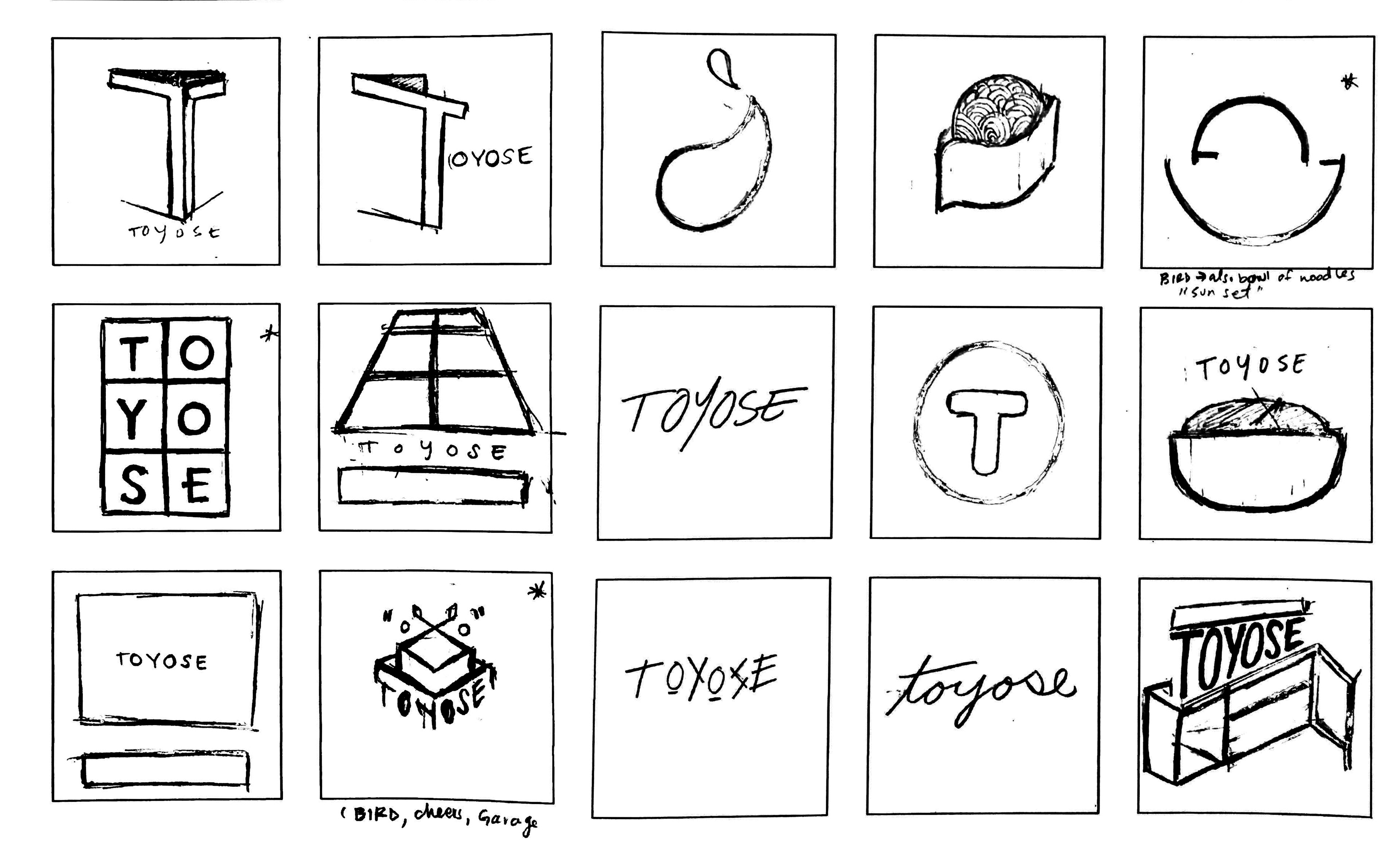
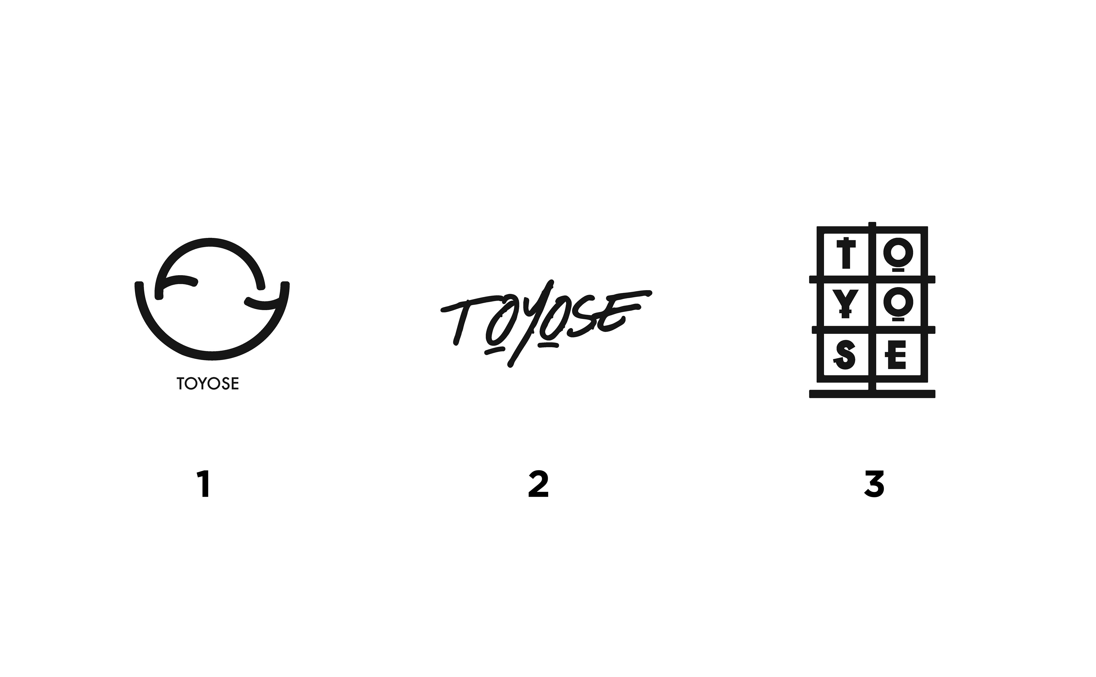
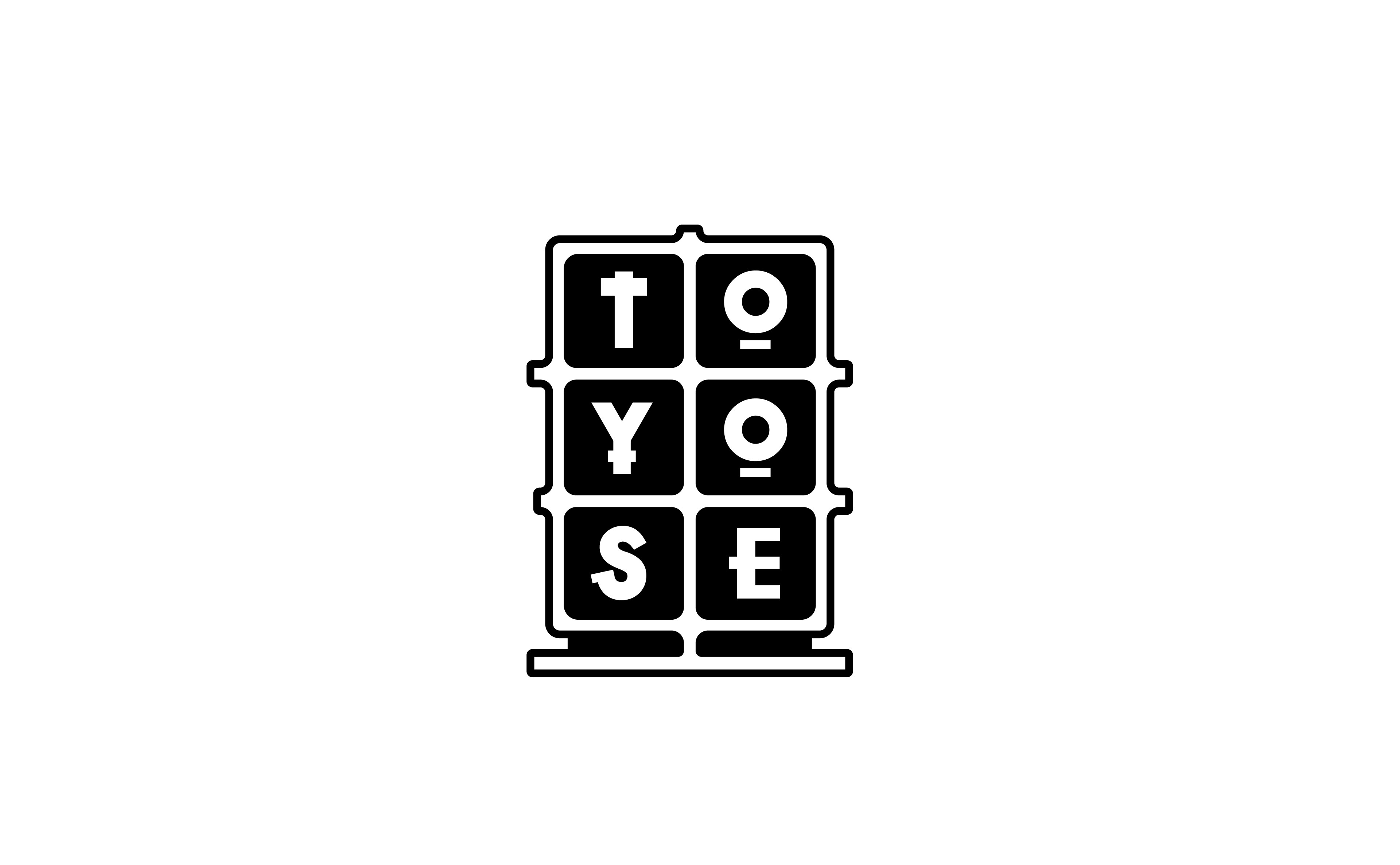
COMPS
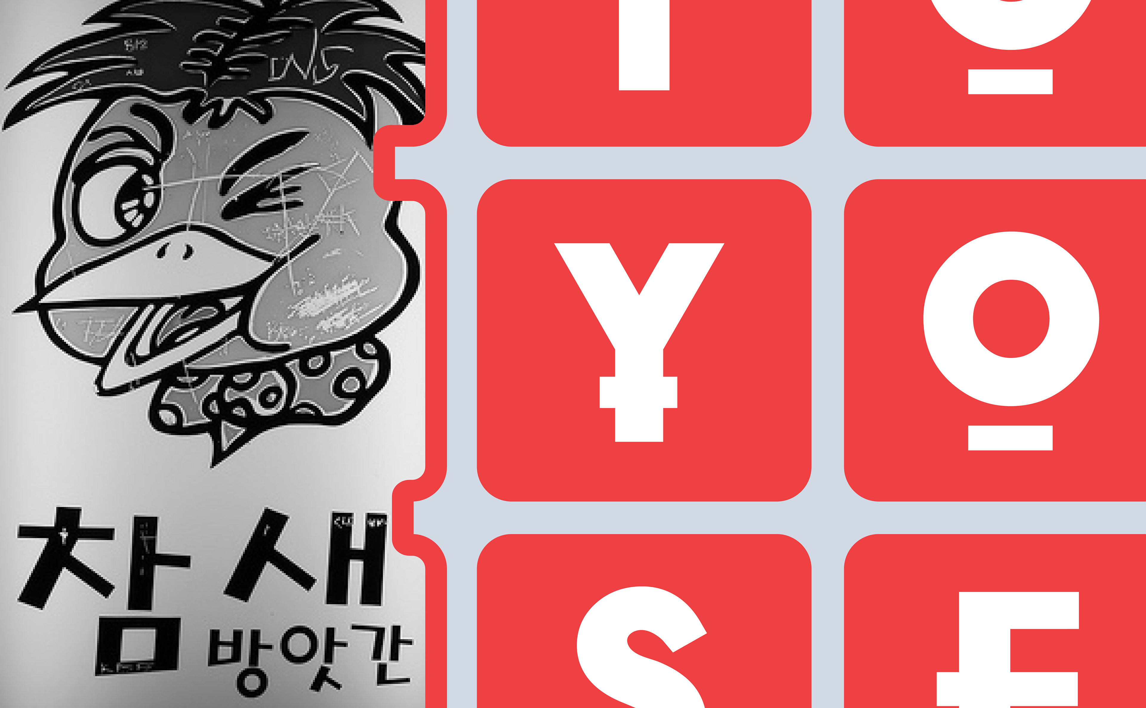
The different comps for the logo best represented the new image for toyose in their own unique ways. The 3 designs here speak to the inclusive, wholesome, and handcrafted feeling a customer gets at Toyose. For the final design, i chose to pursue the design to the right. It represents the private and dicplined environment at toyose. A shield from the rest of the world.
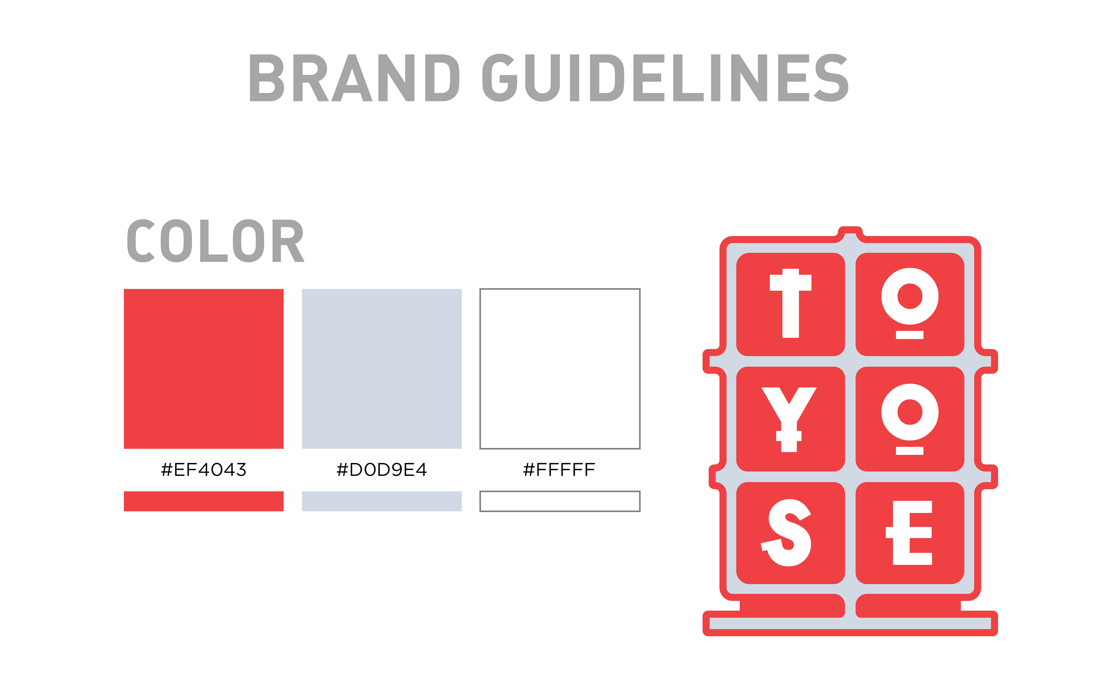
COLOR
The concept for this magazine was to create an homage to design magazines like Communication Arts and Juxtapoz which capture the spirit of expression through visual communications. Orginally named “COMMAND” the addition of the ampersand gave the name a new meaning by tieing communicationi to visual language.
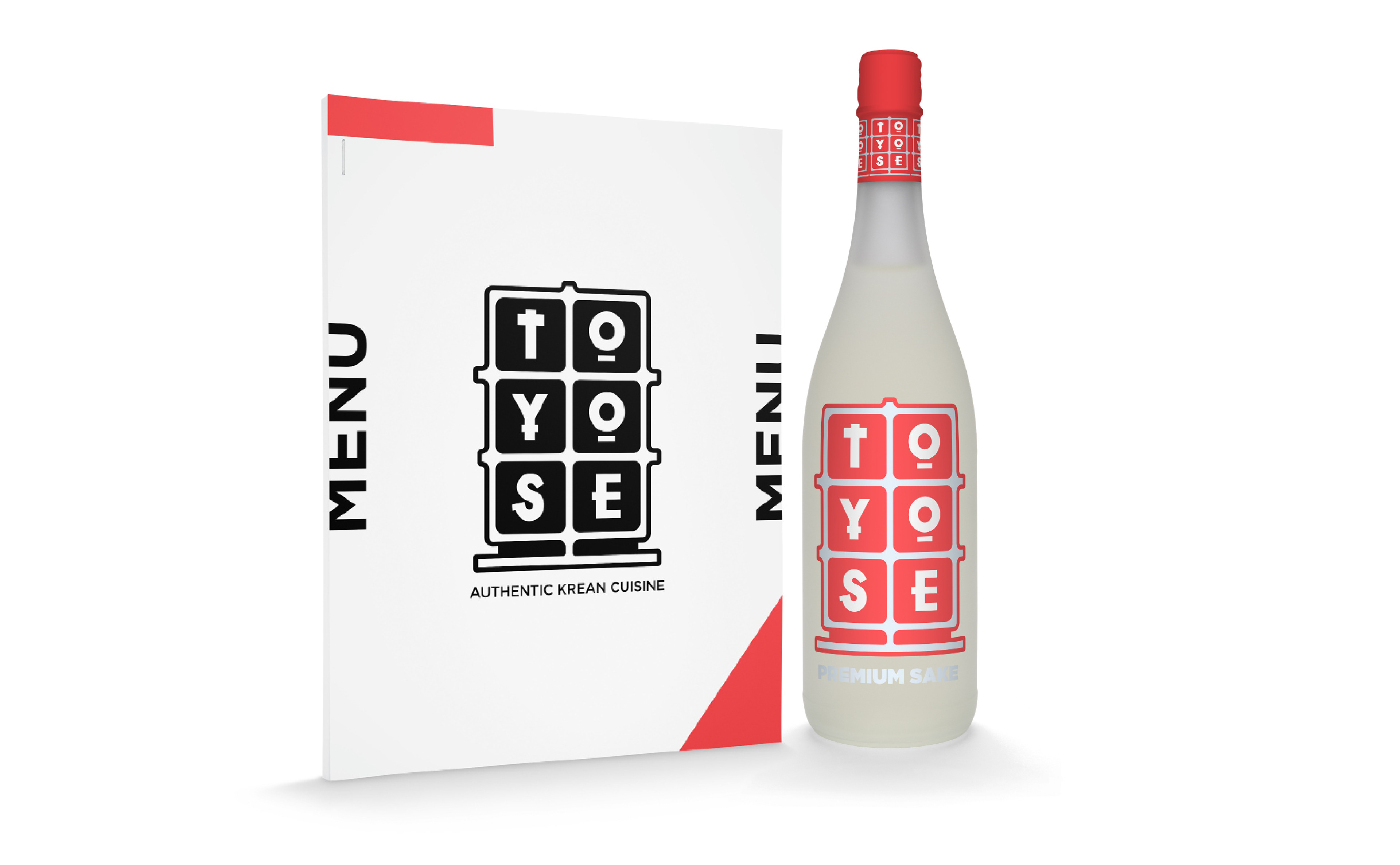
SPACE
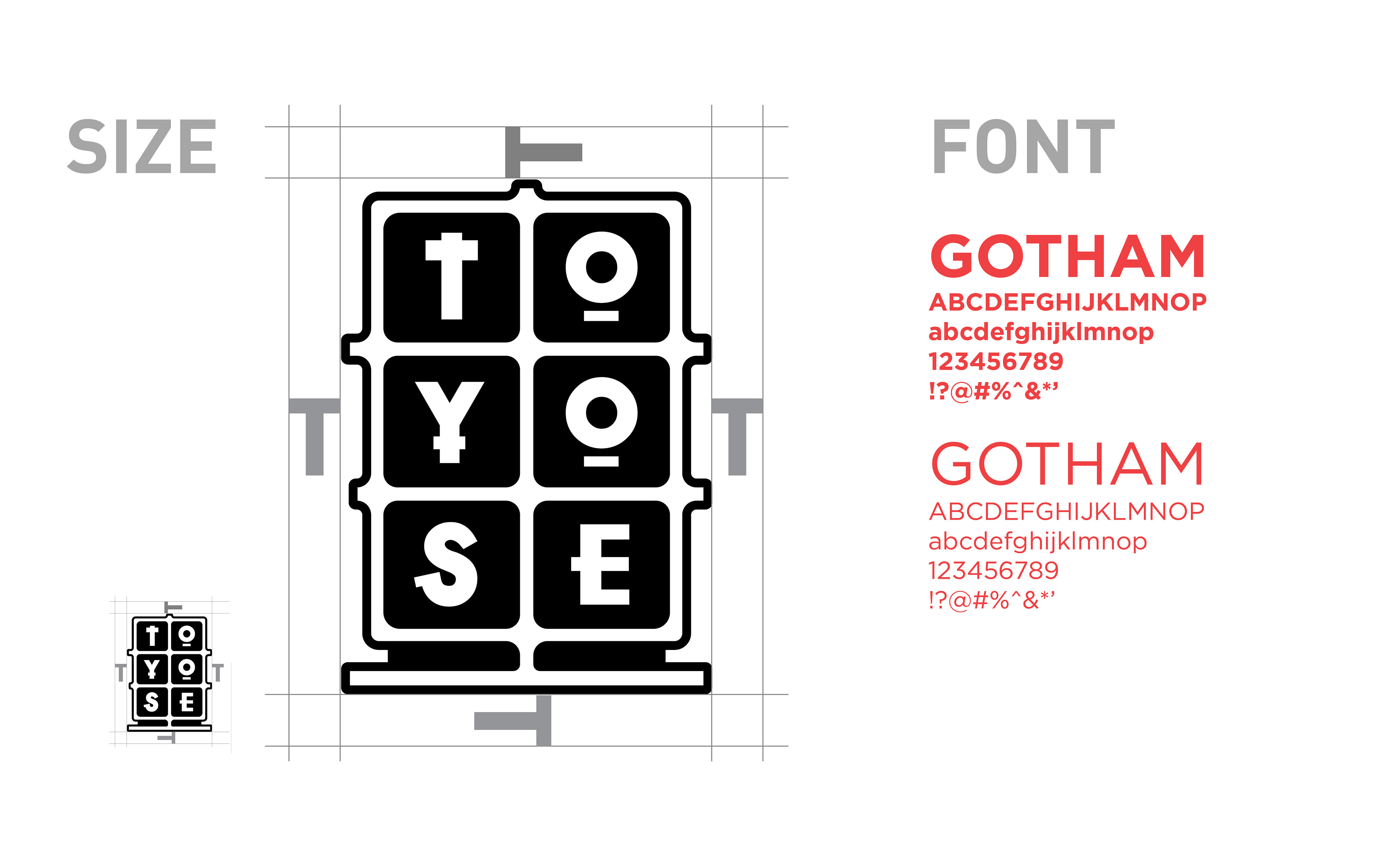
There is only a small space required around the logo. This is because the restaurant itself is compact and has a very communal feeling, text and oother graphics closeby are welcome.
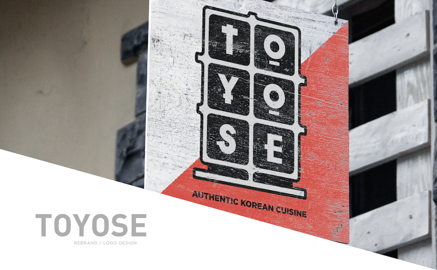
MINIMUM SIZE
Because the logo features bold text on a contrasting background, the logo can me scaled down to a minimum of 1 in. It is small enough to be printed on custom chopstick wrappers